Hello everyone! We are back with a new update, Teamie Violet (1.45). As it is coinciding with the festive period and specifically Christmas, we are also calling it a Christmas Special! So, you can expect Teamie’s user happiness manager Pi to accompany Santa in bringing lots of gifts in the form of new features and enhancements to brighten your festive period 🙂
Before we start showering features and enhancements on you, let’s quickly see the TL;DR version for this update to see what’s in store for you this Christmas. Kindly take note that we will also be covering all the important mini updates that went in between the last update and this one. So, once you are done perusing this post, you will be all caught up!
- Personalised assessments for a complete personalised learning experience
- Learner progress view for instructors
- SCORM enhancements
- Enhanced preview links for link attachments
- Primary & Secondary user identifiers for user import
- Classroom People page migrated to Dash
- Separate category for archived classrooms in sharing settings
- Download audio files attachments
- Detailed classrooms filter on Manage People page
- Question bank enhancements
- User bulk import enhancements
- Rich text support for calendar events, classroom description, rubric scale and criterion description
Personalised Assessments
While Personalised Learning has several aspects and requires different toolsets, we have made some strides in our product for allowing teachers to create and support learning differentiation for their learners.
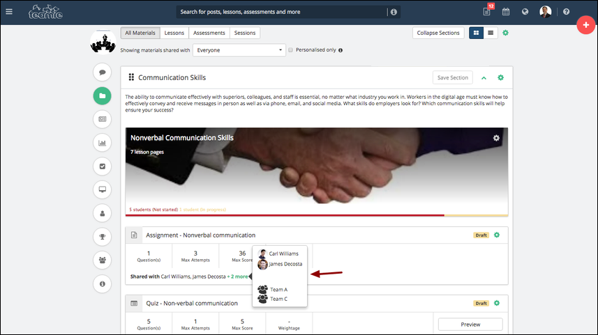
In the past, we have supported the idea of creating teams of learners within a class that can be used for group assessments or sharing resources with specific learners or teams. In one of our latest updates, we added the ability to create assessments and share those with specific learners or teams.
We also published a blog post focusing solely on the personalised assessments. Click here to head to that post and know more about this feature.
Learner Progress View
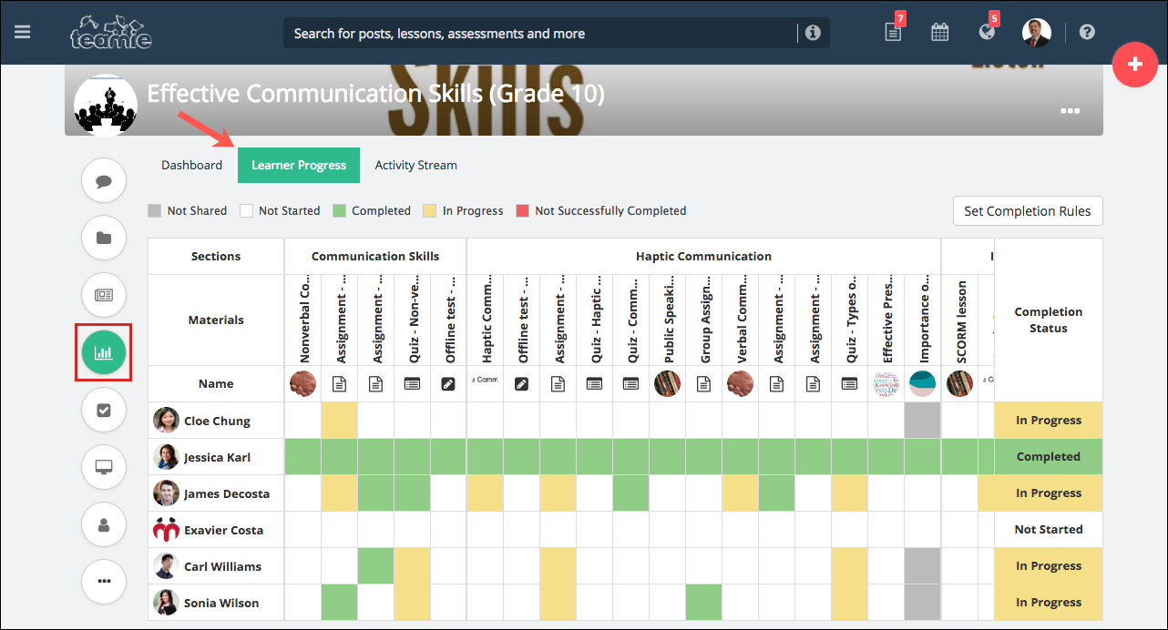
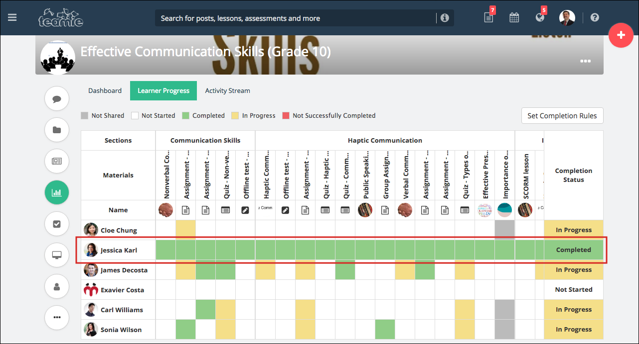
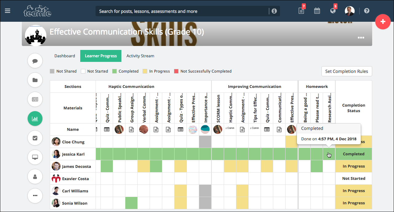
We have introduced a new dashboard view for instructors – Learner Progress. You can find this tab on the Dashboard page of a classroom.
Learner progress view shows you learners’ progress on the materials and homework posts at a glance. Using this view, the final Completion Status of a classroom will be defined based on a rule that you can set for each classroom.
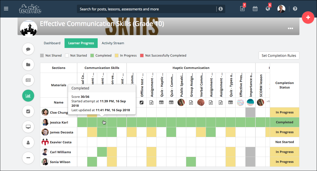
The cells will have the following colours so that the instructor can quickly get the progress. They will not have any values inside and have more details shown on click:
- White: Not started.
- Yellow: In progress. The learner has started the lesson or has a draft attempt for an assessment.
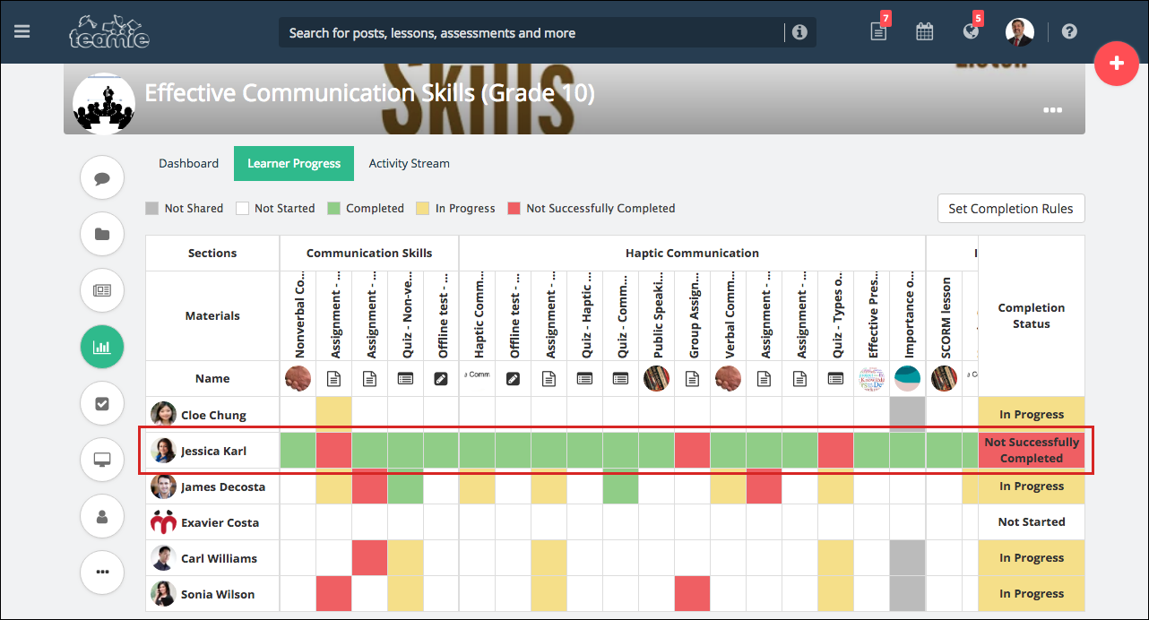
- Red: Not successfully completed. This is when the learner has submitted the assessment but has not gotten the minimum marks required. This will only happen when the score restriction is enabled for each assessment.
- Green: Completed.
- Grey: This material is not shared with this particular user (can happen when a lesson is shared with specific teams/users)
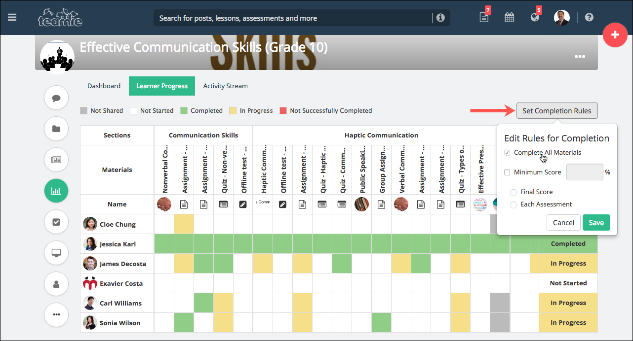
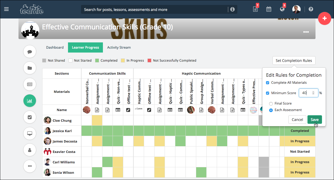
By default, the completion rule is set as ‘Complete All Materials’, which means that once learners completely read all the lessons and attempt all the assessments available for them in the classroom, their progress in the classroom will be considered as Completed regardless of the score received in the assessments.
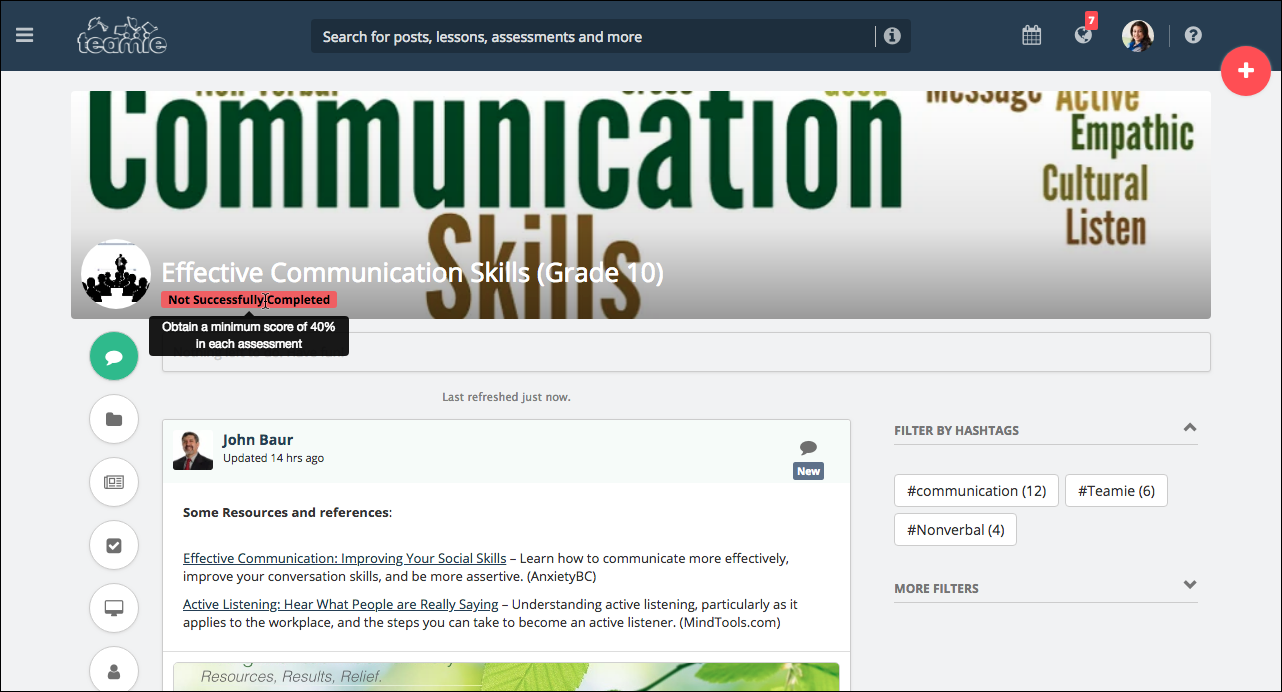
Although, as an instructor, you can set the Minimum Score required for learners for each assessment on the basis of the ‘Final Score’ or the score for ‘Each Assessment’. Unless learners meet this criteria, their completion status for the classroom will be considered as Not Successfully Completed.
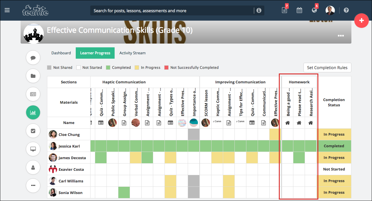
You can also view learners’ task completion status for a classroom from this dashboard view. Although, take note that homework / task does not count to this completion status.
In addition, you can click to view when the learner has marked a task as done.
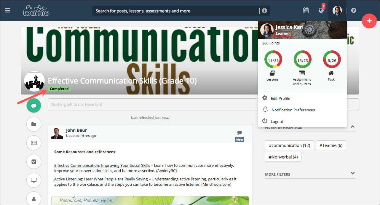
As per their completion status, learners will see a badge with the completion status (In Progress, Not Successfully Completed, Not started, Completed) under the classroom name.
Hovering over the badge will give the learner the completion rule info for the classroom so that they are aware of what they need to achieve for completion.
SCORM Enhancements
With Teamie Violet (1.45) update, we have made some enhancements in the current SCORM functionality on the site to improve how you interact with the SCORM packages on Teamie. These enhancements are based on your feedback and includes adding new fields and a new layout of reports. The details are as following:
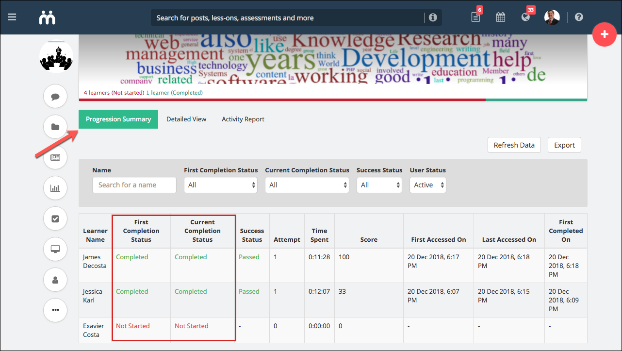
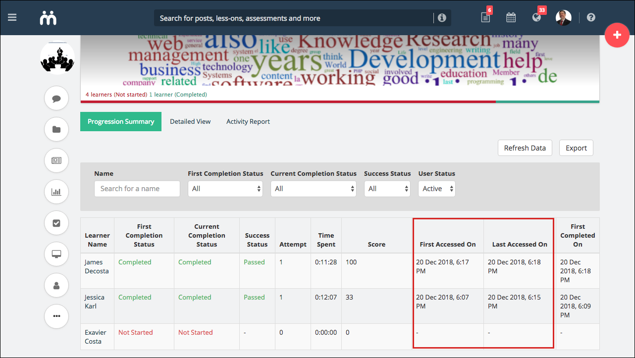
Progression Summary
Currently, when users read and complete the SCORM lesson for the first time and then start reading the SCORM content again, the SCORM package reports the users’ progress as In progress. This raised concerns for instructors as the First Completed Date is shown for the user who have completed it, but the overall status is still appearing as In Progress.
In order to quell this misunderstanding, we have made an enhancement in this workflow, which will consider the SCORM lesson as completed, if the learner has completely read it once.
For instructors, the current ‘Completion Status’ column will be divided into two newly introduced columns – ‘First Completion Status‘ and ‘Current Completion Status‘. This way, if the user has completed the lesson once and then re-reads it for one or more times, then the completion status will be updated accordingly. Also, users’ lesson completion stats (bar/donut) will now be based on their First Completion Status and not the Current Completion Status.
In addition to the aforementioned enhancement, we have also added couple of columns in the Progression Summary tab – First Accessed On and Last Accessed On. These columns will convey the first time and the last time at which the user accessed the SCORM content, respectively.
Also, the learner will see a tick mark (in lesson collapsed view) and 100% green bar (in lesson expanded view) after completely reading the SCORM lesson the first time.
Detailed View
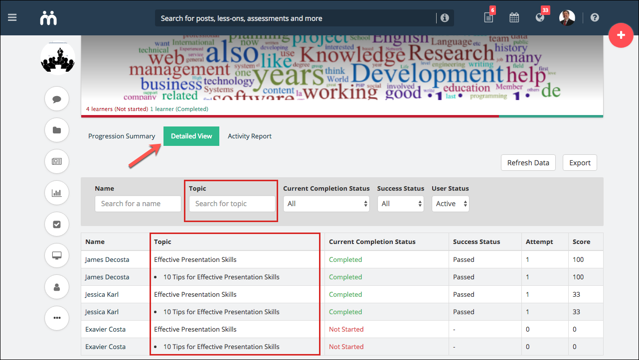
In the Detailed View tab of a SCORM lesson, we have made the enhancement in how instructors will view the details of the SCOs (SCORM pages).
Unlike the current display where the detailed view has the SCOs (SCORM pages) listed column-wise, we will now be showing them row-wise for better readability and easier filtering. The SCOs will be listed in bullet points under their respective headings under the Topic column. The Detailed View page table will have the Name, Topic, Current Completion Status, Success Status, Attempt, and Score columns.
Also, a nifty Topic filter is added on the page to quickly filter the topics of the SCORM for different learners.
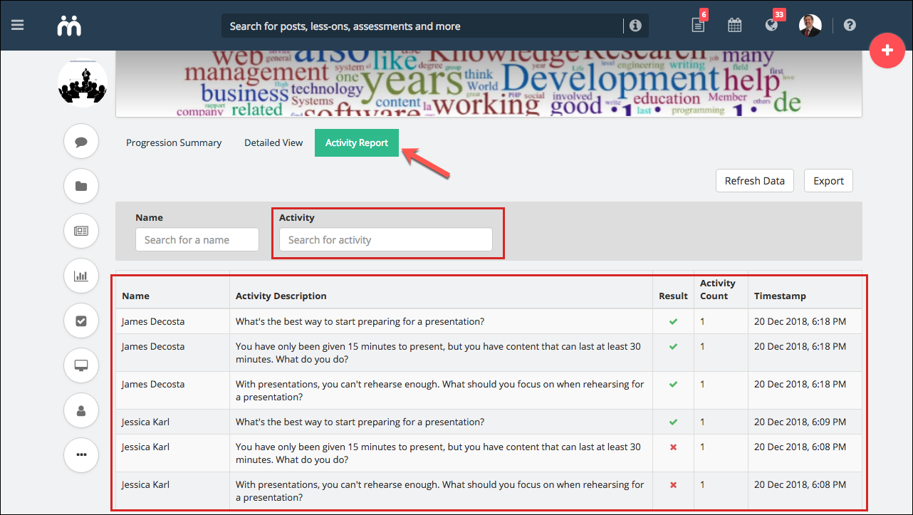
Activity Report
The Activity Report page also got a similar layout change. The current report has each activity listed column-wise. For better readability, we are having this listed as row-wise.
Unlike the previous reports, we are not categorising the activities by the user but are listing each activity and its data as a vertical list, reversed chronologically (latest at the top) as per the activity’s timestamp. The Activity Report page table will have the Name, Activity Description, Result, Activity Count, and Timestamp columns. An Activity filter is also added to quickly search for an activity.
Minor Enhancements
Following are some enhancements that were rolled out between the Teamie Ultramarine and Violet updates.
Enhanced Link Previews
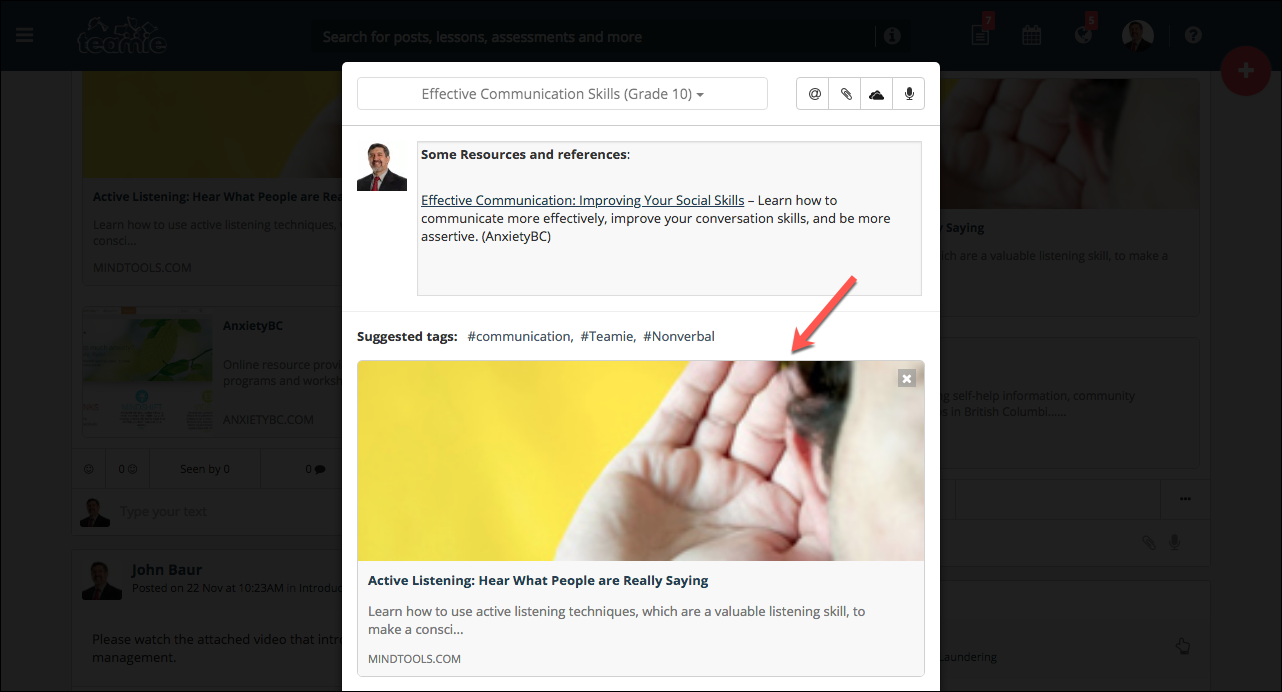
We have made link previews more prominent in order to give a better idea to users of what they are about to tap on.
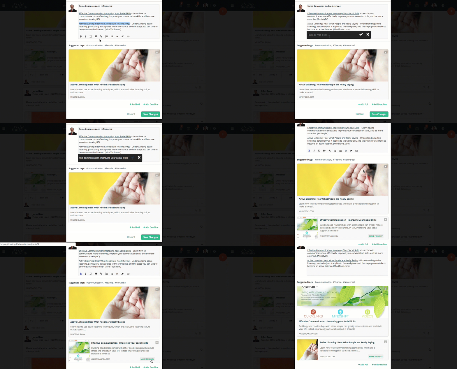
So, if a single link is attached to a post, a bigger and more prominent preview will be shown while creating/editing the post and the same will be shown once the post is actually shared.
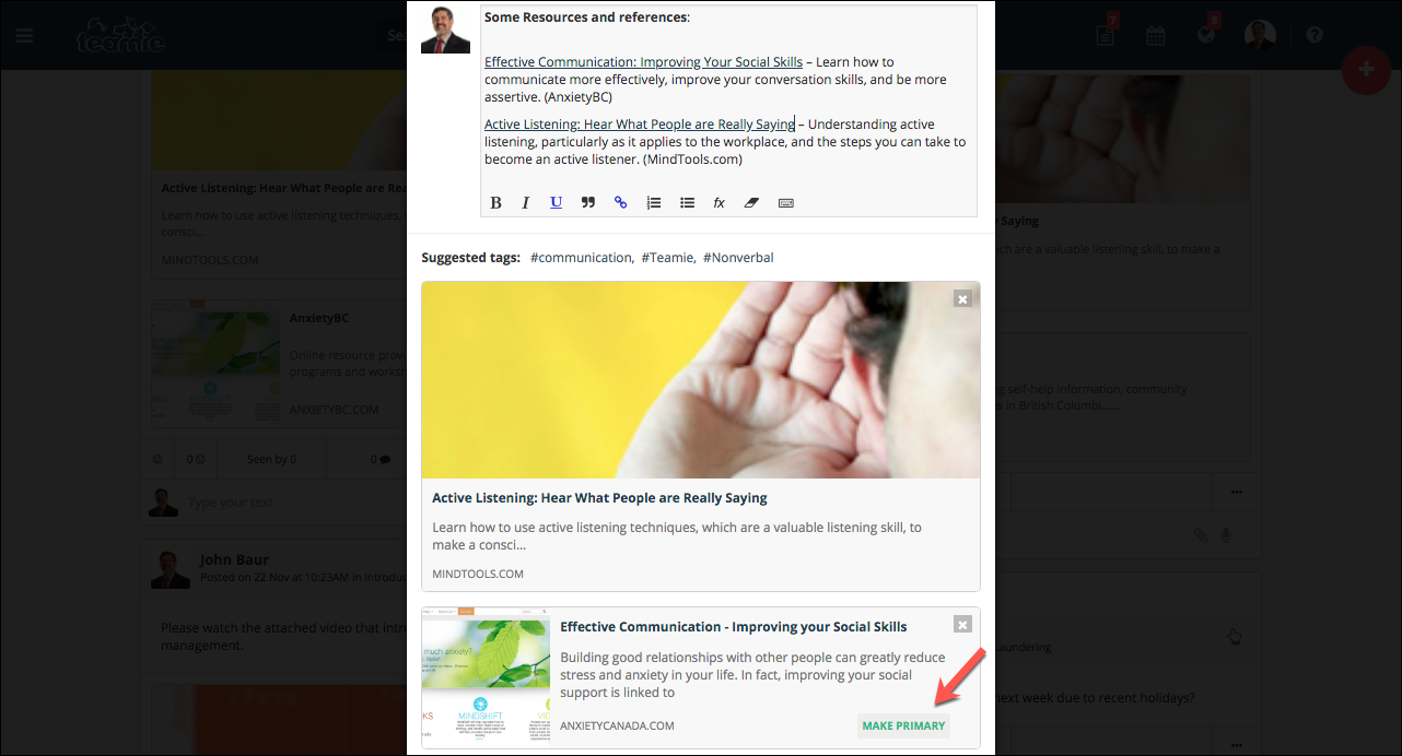
All the subsequent links attached to the post will have smaller thumbnails with an option to show them as primary thumbnail. So, users are able to control whether they wish to set a link as primary or not in a post.
Following GIF demonstrates the overview of the aforementioned workflow:
Primary & Secondary User Identifiers
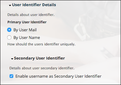
As per the previous existing workflow, all users need to have a username field and an email field. The main purpose of the username field is to login to the site. Email can also be used to login, and is a way for the platform to communicate with the users. But some clients gave us the feedback that they use Google SSO and would not require username for their users. On the other hand, some clients want to use only usernames while creating a user.
We understand that different sites may have different setup requirements and therefore, we decided to introduce Primary and Secondary fields for user creation.
Primary Field
Primary field will have the values that will be used to differentiate users; this can be either username or email. This field will be set from our side based on a client’s requirement, whether they want the username or the email to be their primary field. Primary field, when set, will make sure that:
- Every user on the site has this field with a valid value (which cannot be auto-generated)
- Primary field is unique
- Users can use it to login to the site (for non-SSO site)
- During bulk imports of users, it will be used to identify users (if the account exists, then it will be updated, else a new account will be created)
- It will be the first field of the bulk import, which means it cannot be updated through the bulk import sheet
- It is visible in the Manage People page for administrators at the site level
Secondary Field
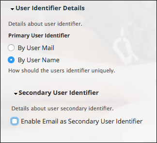
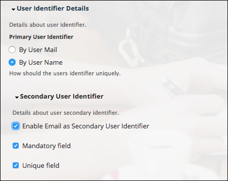
Depending on the chosen primary field, the following settings will be available for the secondary field:
If User email is set as the primary field:
If Username is set as the primary field:
Classroom People Page migrated to Dash
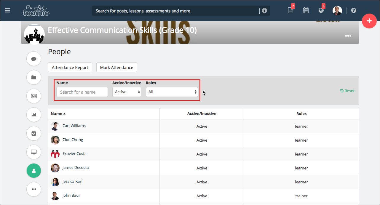
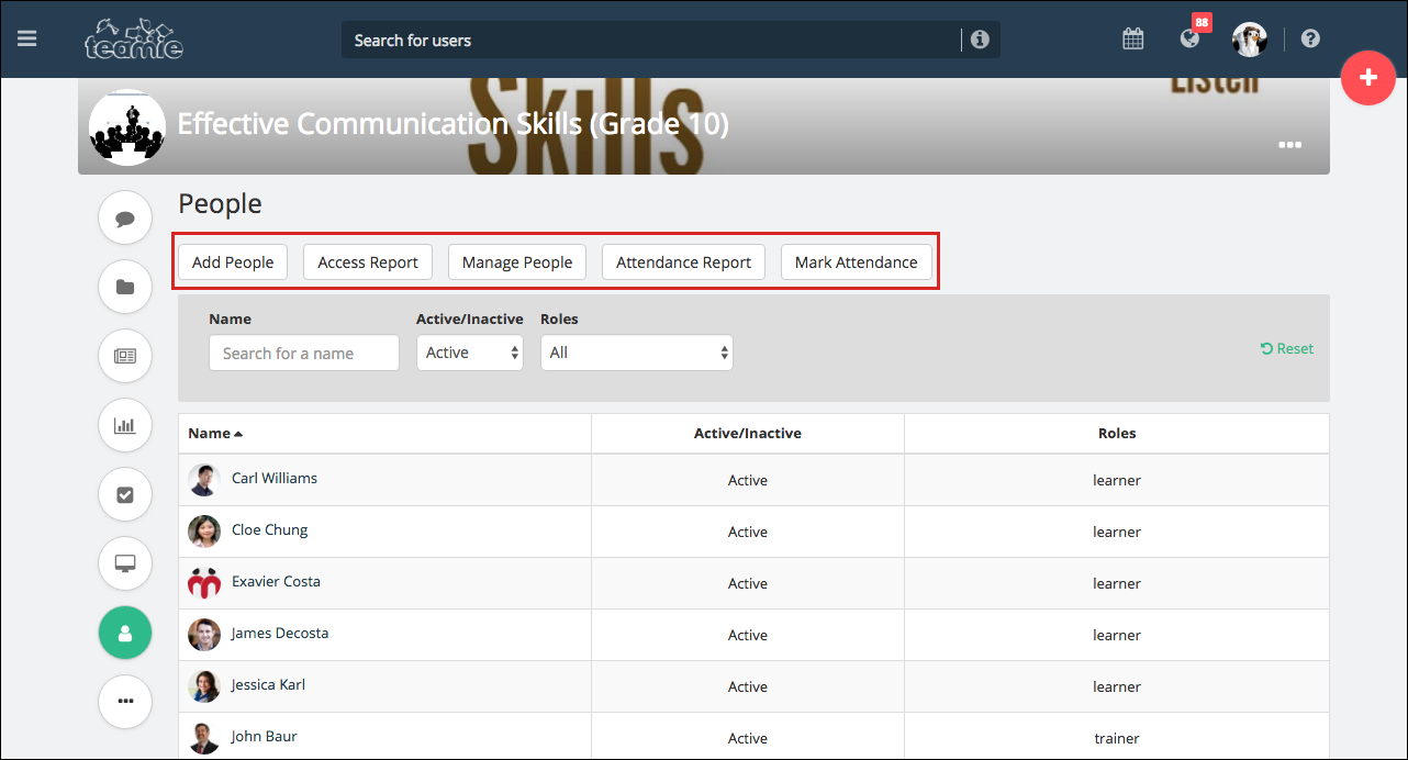
We have migrated the classroom people page to Dash in order to maintain consistency throughout the platform. The revamped page will have Active/Inactive filters for instructors to quickly sort learners according to their status (Active/Inactive) in the classroom. Users can also be sorted on the basis of their roles as well on the basis of their names.
For administrators, the required options to manage classrooms’ users will be present.
Separate Category for Archived Classrooms
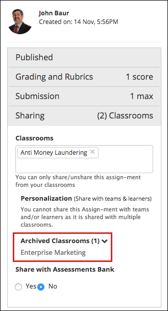
We got this feedback from clients that when they create classrooms with the same title for new academic year and archive the previous year classrooms. Then, if an assessment / lesson is shared with multiple classrooms in the last academic year and those classrooms have been archived in the current academic year, it becomes pretty tedious to figure out which classrooms are from the current academic year and which ones are from the last academic year.
To counter this, we have introduced a separate Archived Classrooms box under the Sharing settings in an assessment / lesson, which will appear if the assessment / lesson is shared with an archived classroom.
Downloading Audio Files
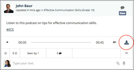
This enhancement is the result of one of our client’s feedback (so keep sharing yours!). If the Content Security mode is not enabled on your Teamie site, audio attachments will have a download option for users to download. This can come in handy if the users wish to download the content (which maybe in the form of a detailed feedback or a podcast) and listen to it offline at a later stage.
User will be able to download audio files attached at the following locations:
- Newsfeed (post/comment/reply attachments)
- Lesson page attachments
- Assessment Attempt/Offline Record audio comments
Detailed Classrooms Filter on Manage People Page
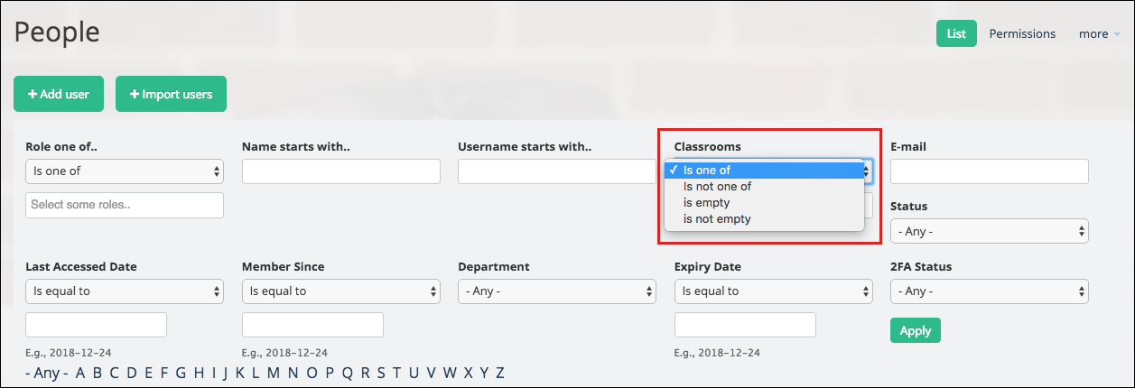
We are enhancing the way you can search for users based on their classrooms.
The previously existing filter already has the operator one of, which allows you to choose one or more classrooms.
Now, you can search based on the following four options:
- is one of (default): filter users who are part of any of the following classrooms
- is not one of: filter users who are not part of any of the following classrooms
- is empty: filter users who are not part of any classroom
- is not empty: filter users who are part of at least one classroom
Question Bank Enhancements
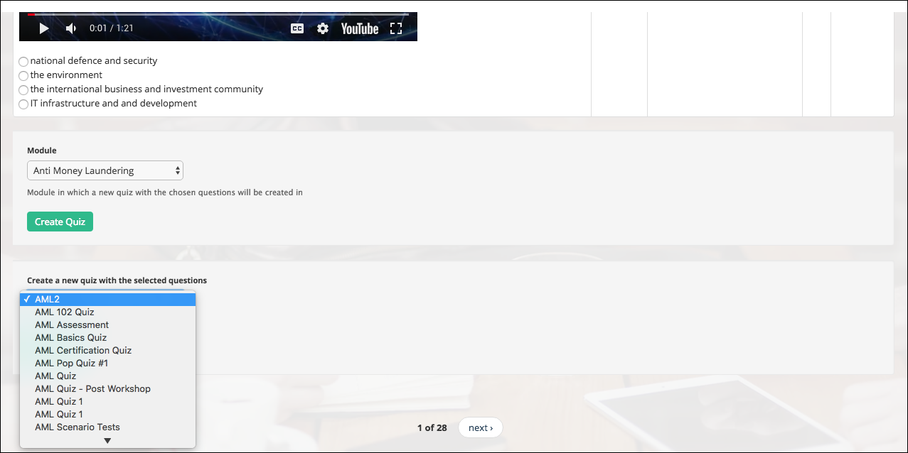
We have made some enhancements in question bank to improve the existing workflow and make it simpler to copy questions to a quiz in your classroom. All draft and published quizzes from all your classrooms will appear in the drop-down list when you import selected questions into an already existing quiz (which could be published or in draft state).
Also, quizzes that are not shared with the quiz bank will appear in the quiz listing drop down for the instructor who is importing selected questions from the question bank into an already existing quiz. In addition, some minor changes are made to the help text to make it more relevant.
User Bulk Import Enhancements
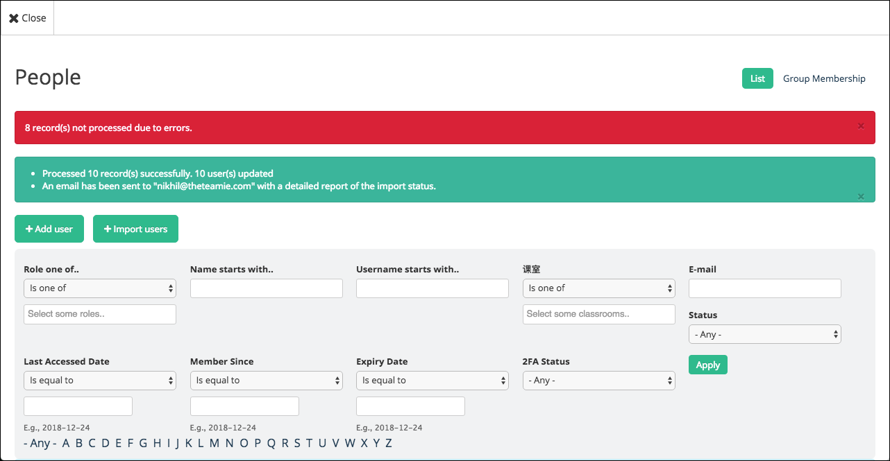
After the bulk import is successful, we wanted to inform administrators on the status of the imported users. So, as an admin, when you import users, the import process will be completed based on the following three statuses:
- Success: Users get created/updated without and issues
- Success with potential errors: Users get created/updated with potential issues due to missing fields. These fields are usually meta fields.
- Failed: Users don’t get created/updated. These errors are either in username or email, which are necessary for any user-creation process.
The status will be displayed to the admins via:
A. Status Messages
After the bulk import is complete, if there are users with the above statuses, there will be a corresponding success/warning/error message(s) as shown in the following screenshot:
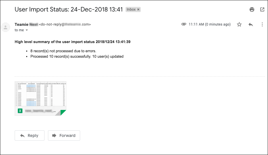
B. Excel
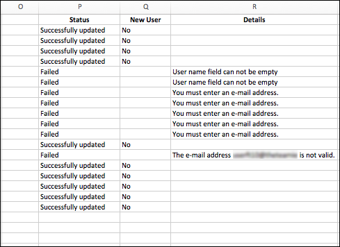
Although the above statuses provide a good summary, they are not stored and do not convey the full details to admins regarding which users got created and which failed etc. For this information,an email will be sent to their registered email ids with the uploaded bulk imported template with the addition of the following three extra columns at the end:
- New User?: This is a Yes/No column indicating whether or not the corresponding user in that row is a newly created user on the site or an existing one.
- Status: This will be one of the aforementioned three statuses.
- Errors: If user creation fails, this row will show the details due to which the process failed (for instance, Email address is not valid/Username field is missing). This will help you rectify the mistake and complete the bulk import successfully.
Rich Text Support
We have introduced rich text in the description for the following workflows:
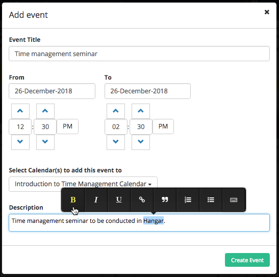
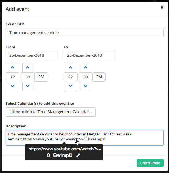
Rich Text Description for Calendar Events
Calendar events’ description will now include rich text options.
Furthermore, any URLs pasted will automatically become a clickable link for users to directly navigate to.
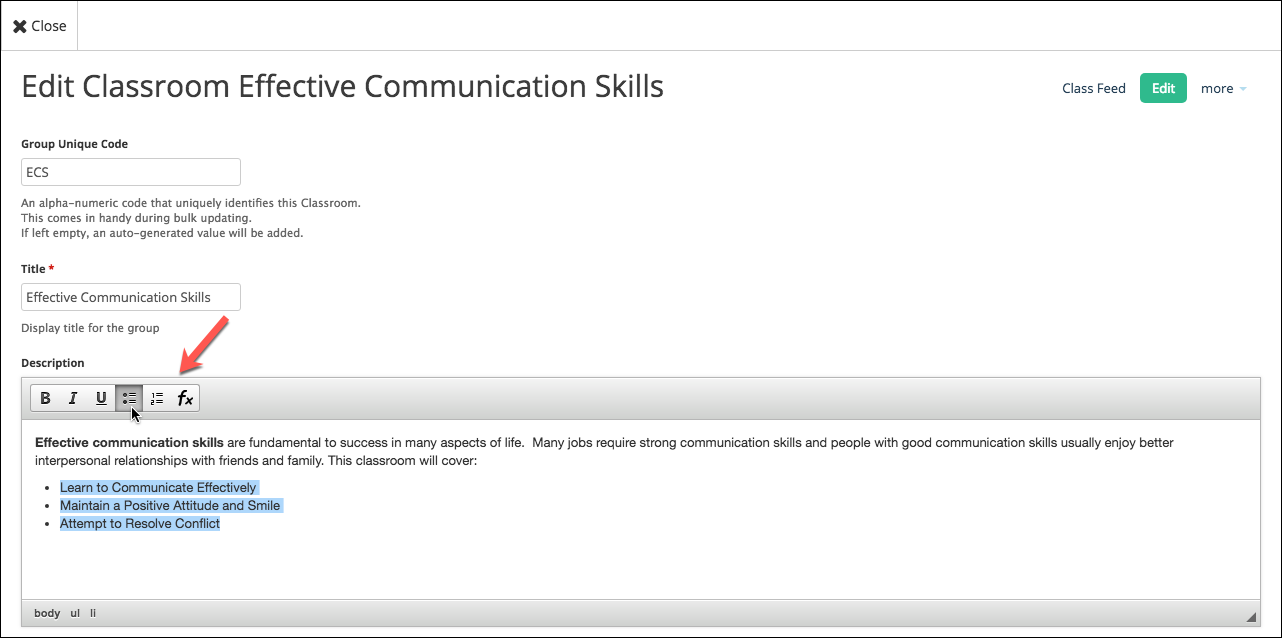
Rich Text for Classroom Description
The classroom description will also have rich text options that can be used while creating/editing a classroom.
Users will be able to view the rich text when they view a classroom’s description from its ‘About’ page.
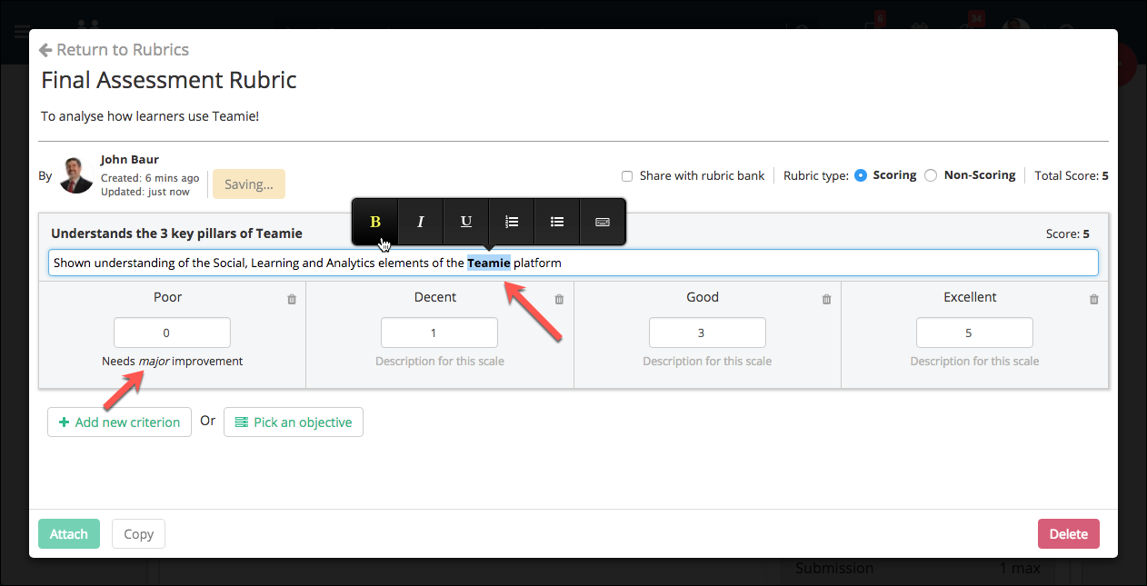
Rich text for Rubric Scale and Criterion Description
In addition to the aforementioned, we have also added the rich text options for the rubric scales’ and criteria description.
Following rich text buttons are supported:
- Bold
- Italic
- Underline
- Numbered list
- Bullet list
- Virtual Keyboard
So, that’s it for this update. We wish you a Merry Christmas and a Happy New Year 2019. May the new year brings you all the happiness and collaborative learning and training! See you next year 🙂

