Login Revamp
We are happy to introduce a more efficient and intuitive login workflow in both our apps. As opposed to the previous login workflow, that uses the web views to deliver the login functionality, we have made the login workflow completely native to the apps. Not going into the technical details, simply speaking, you will have a more seamless experience while logging into the Teamie apps 🙂
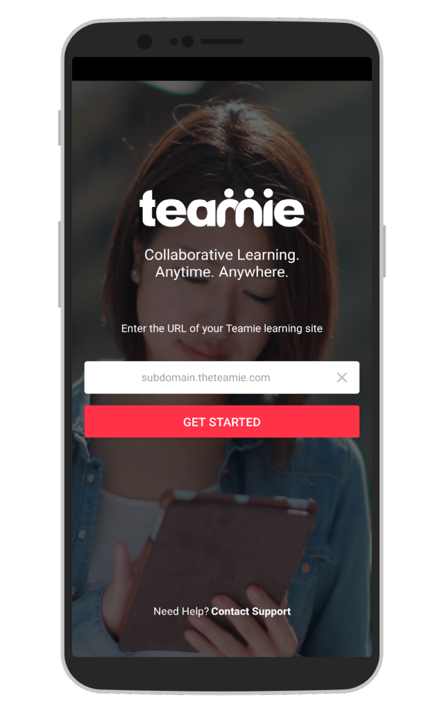
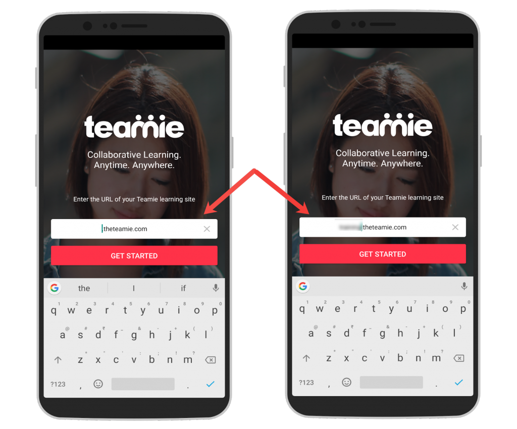
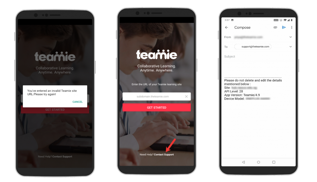
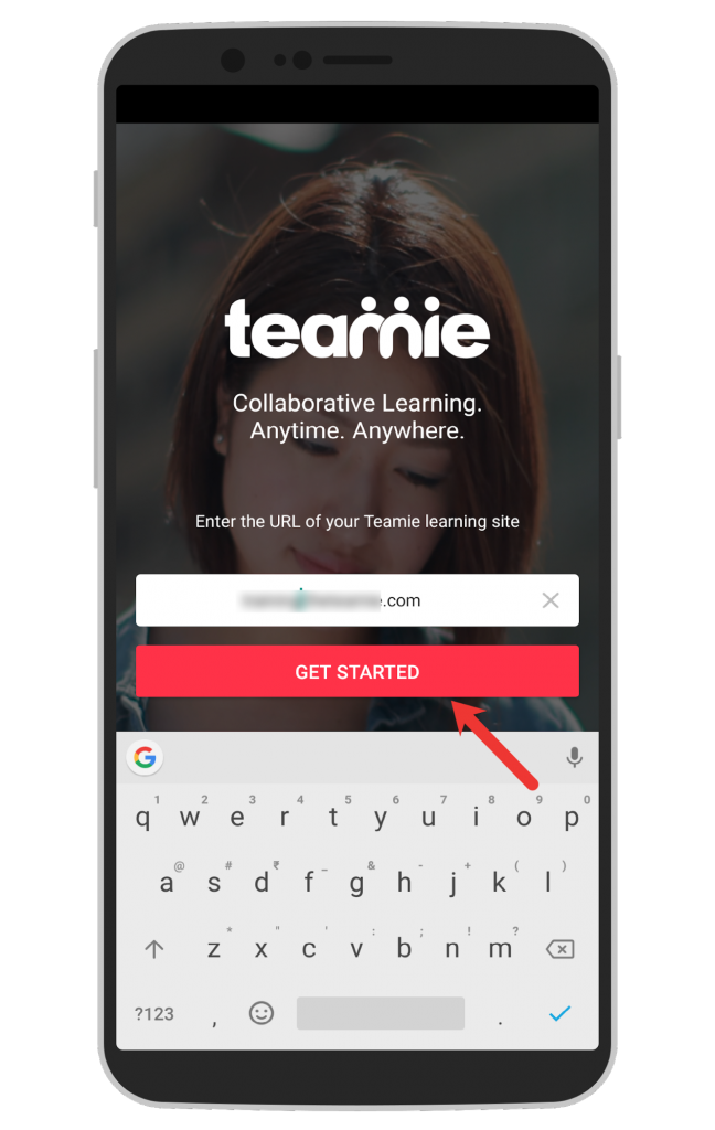
As shown in the above screenshot, the first screen itself will have the input field for entering your site’s URL. Tapping that will allow you to quickly add the subdomain for your site.
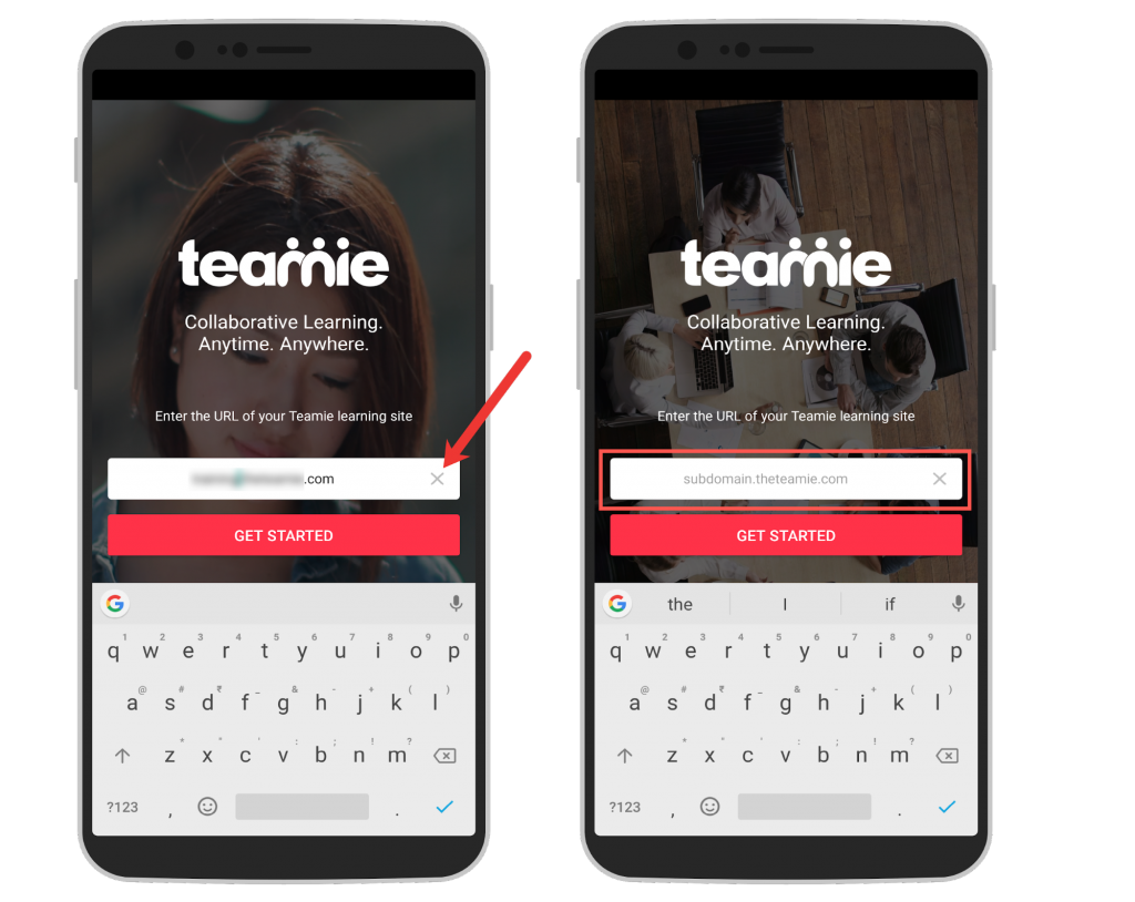
You can also tap the ‘X‘ button to quickly empty the field and enter your site’s URL.
In case you are getting some error message related to URL’s validity or you are facing some other issues while logging in, you can tap the Contact Support link at the bottom of the screen to quickly contact our support team via email.
Once you have entered the URL, tap GET STARTED button to validate your credentials.
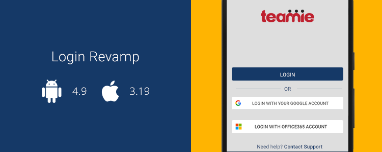
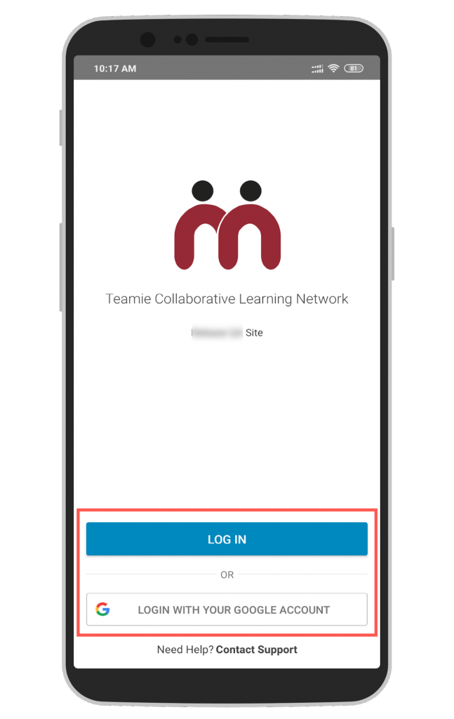
Based on the method(s) used on your site for logging in, you will see the corresponding login options. For instance, if your site uses Google single sign-on (SSO) for instructors and learners to login to Teamie along with manual login (username and password) for other roles, then you will see both the options on the screen.
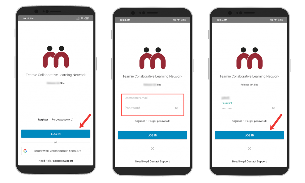
Tapping LOG IN will show the user credential input fields. Enter your credentials and tap LOG IN to access your Teamie site with your user credentials, if applicable.
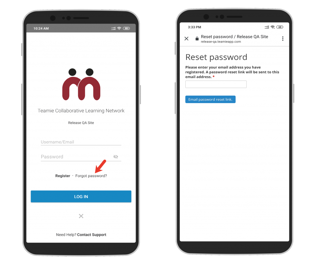
You can also tap the Forgot password? link in case you have forgotten your password. Enter your registered email and we will send you an email with a link to reset your password.
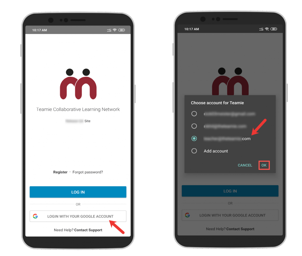
If your site is configured to have an alternate login method, that will also be available. For example, tap LOGIN WITH YOUR GOOGLE ACCOUNT and choose the account registered with Teamie to login using your registered Google Account.
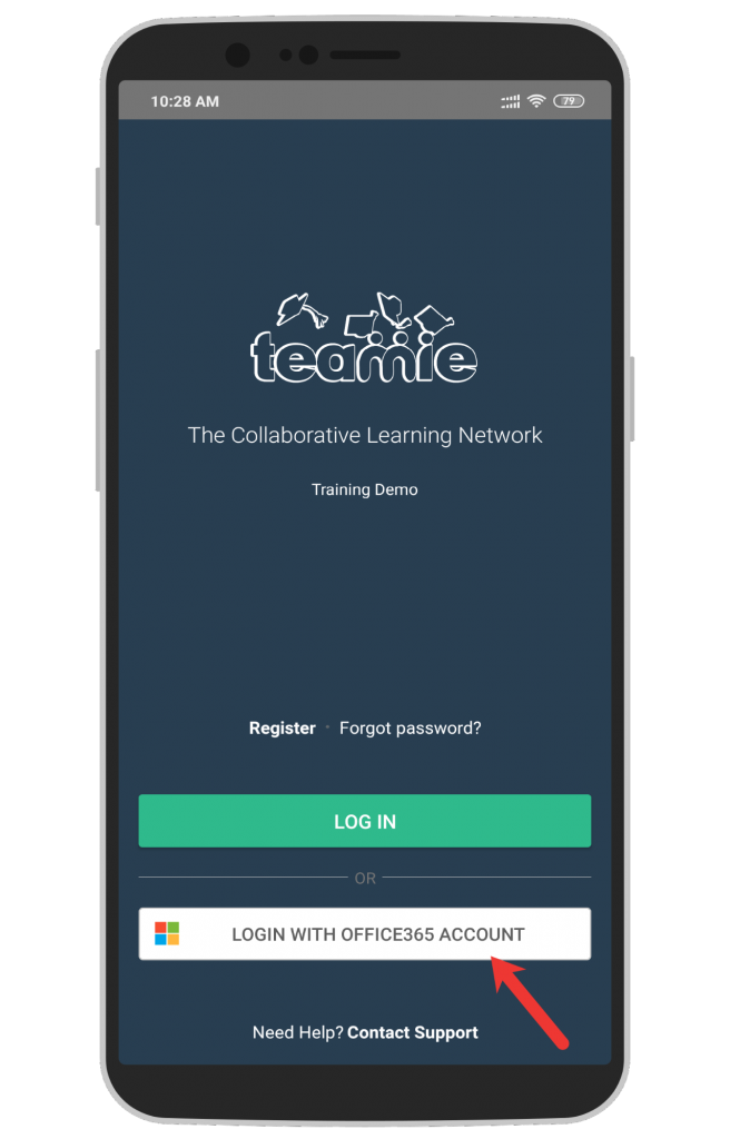
Similarly, you can login using your OneDrive credentials.
So, update your apps and try out the new login workflow. It would be great if you could give us a shout-out or write to us for any suggestions and feedback 🙂
Post Creation Revamp (Android)
In our recent Android app update, we introduced the revamped post creation. We also promised that we will be adding new functionalities and extending the existing ones to make the post creation even more appealing and functional. This especially applies to the variety of attachments that can be added to the post, whether from file storage services or with the help of the materials picker. Following are the enhancements:
- Google Drive and OneDrive file attachments
- Materials picker
- Post settings enhancement
Let’s get into their details now.
Google Drive and OneDrive File Attachments
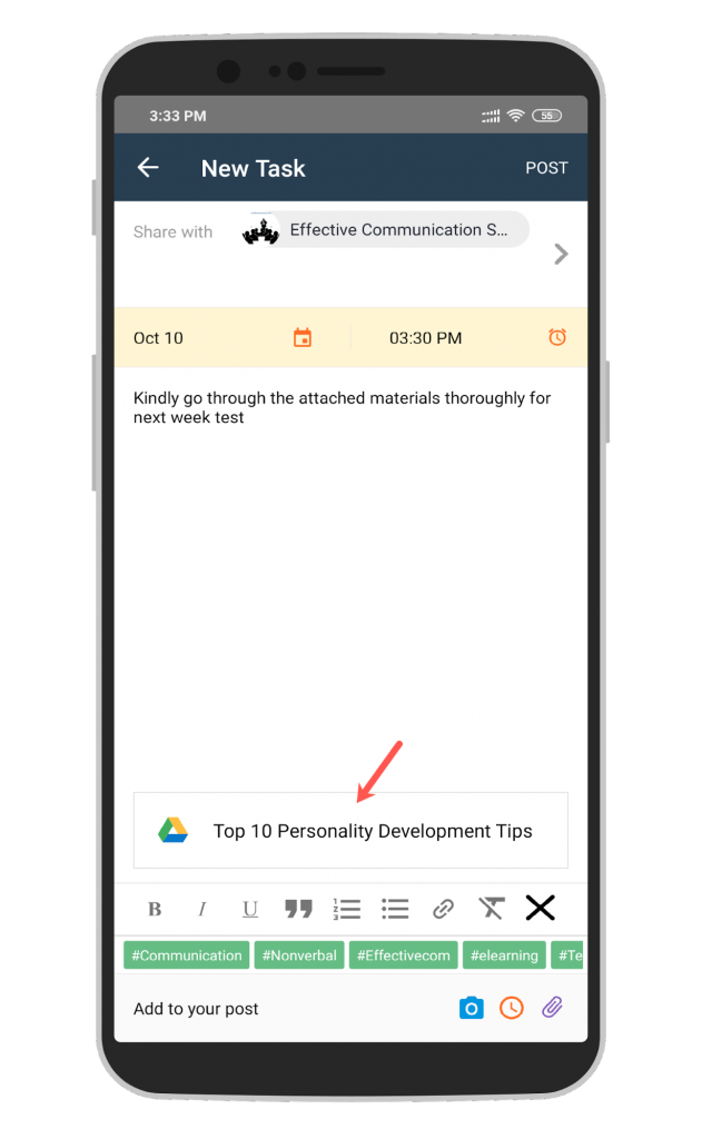
Similar to the functionality available in web, you can now attach documents from external file storage services – Google Drive and OneDrive to your posts.
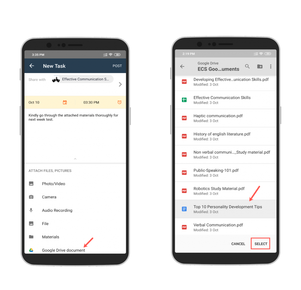
Once you tap the Google Drive document option under the ATTACH FILES, PICTURES menu, you will be able to select files from the native Google Drive picker.
The selected file(s) will be attached to the post at once.
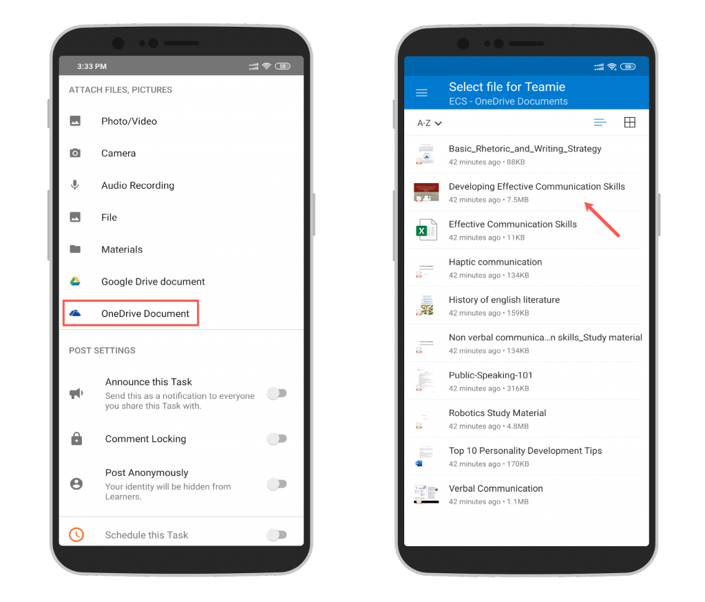
Similarly, if OneDrive integration is enabled on your Teamie site, you can pick OneDrive files from the native picker.
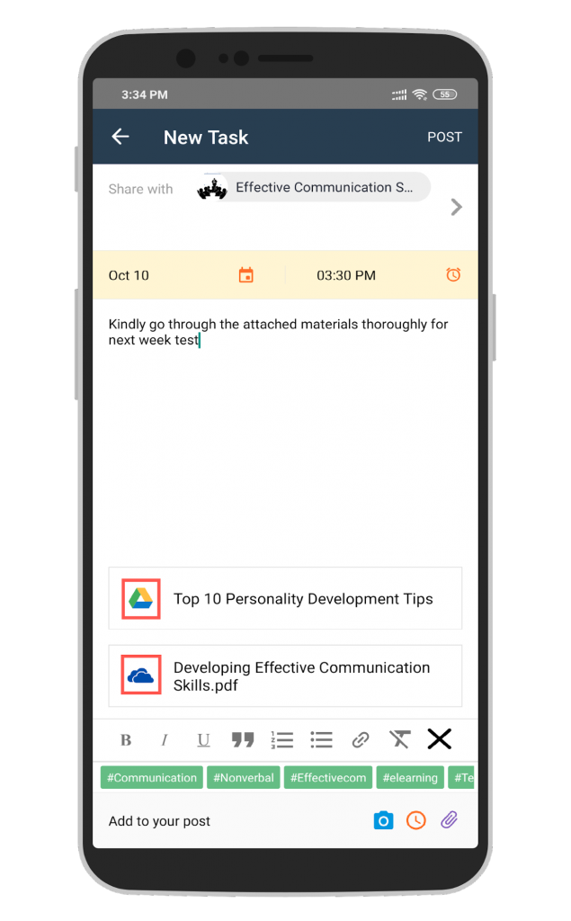
The attached file(s) gets attached to the post. Additionally, you can easily identify the files from Google Drive and OneDrive with the help of their icons on the attachments.
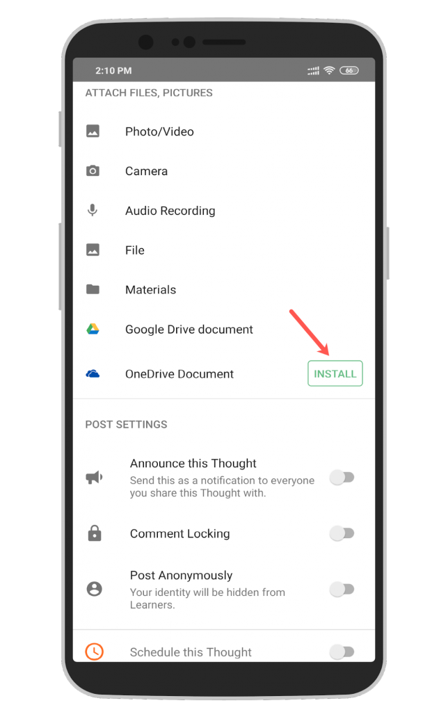
In case the OneDrive mobile app is not installed on your mobile device, an Install button will be present that will redirect you to the Play Store.
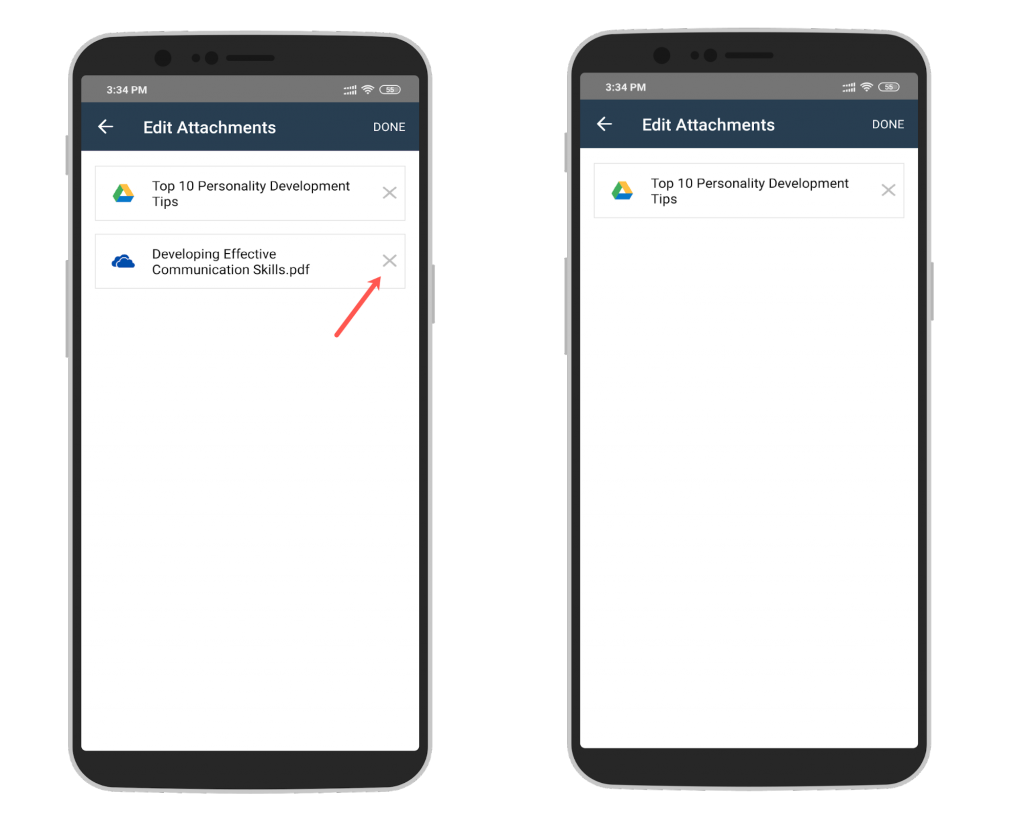
In order to remove any attachment, you can tap on it to open the Edit Attachments screen and then tap the ‘X’ icon for the required attachment.
Materials Picker
Materials picker is a useful tool to tag and map Teamie materials (lessons, lesson pages, and assessments) to posts quickly. Now, you can use the Materials picker while creating a post from the Teamie Android App.
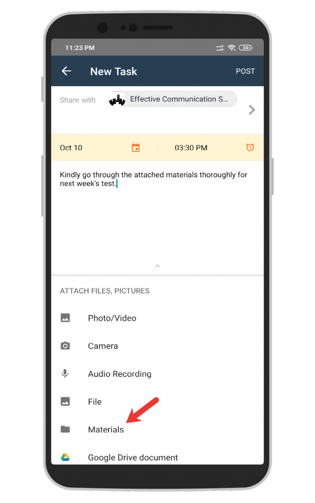
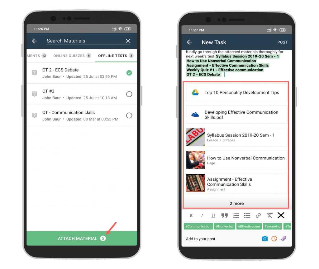
Tap the Materials option with at least one classroom selected.
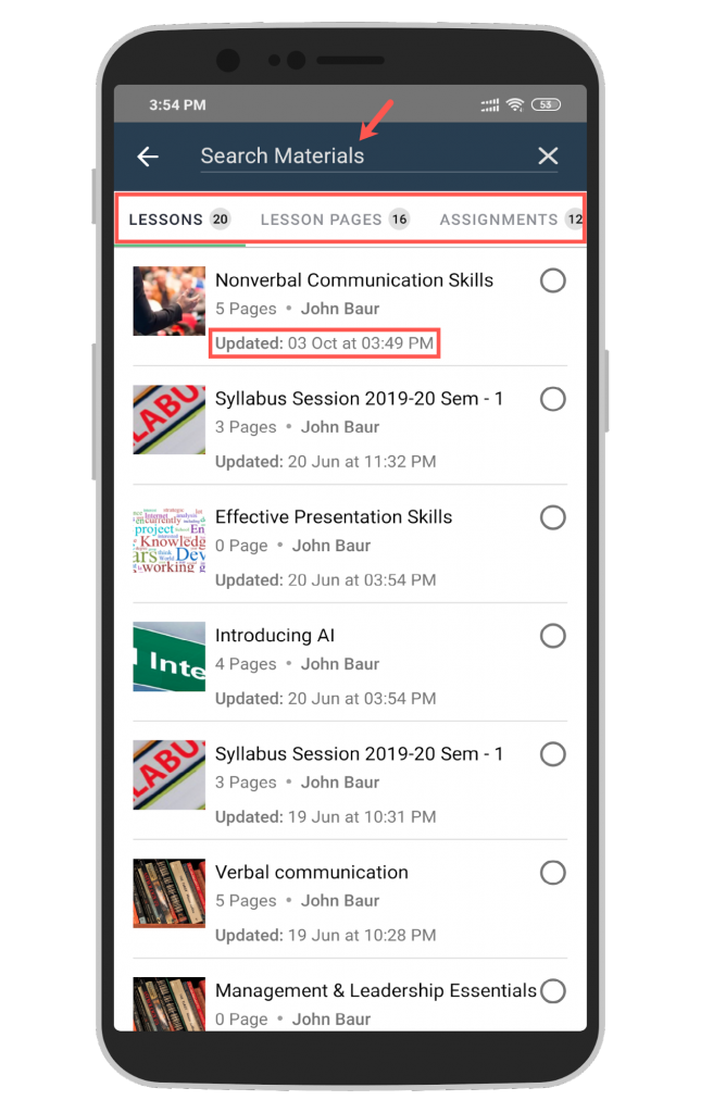
All the published materials of the classroom are shown in the picker, segregated in tabs on the basis of the respective materials type. In case you select more than one classroom to share the post, the materials common to those classrooms are listed. In addition, a search bar will be present at the top of the screen to quickly find the relevant materials.
Note: By default, the most recently updated material will be shown at the top in the picker.
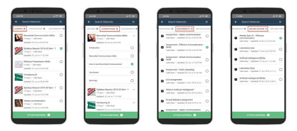
You can select multiple types of materials (Lessons, Lesson Pages, Assignments, Quizzes, and Offline Tests) from different tabs in a single go, thus saving a lot of time.
Note: For selecting a lesson page, you need to first expand the lesson in the Lesson Page tab and then select the page.
While selecting materials, you can see the total count of materials that you have selected. Click Attach to attach the selected materials to the post. Once attached, the materials will appear as highlighted tags in the text area and also as attachment cards in the attachment section. Removing the highlighted tags will remove the corresponding material.
Post Settings Enhancement
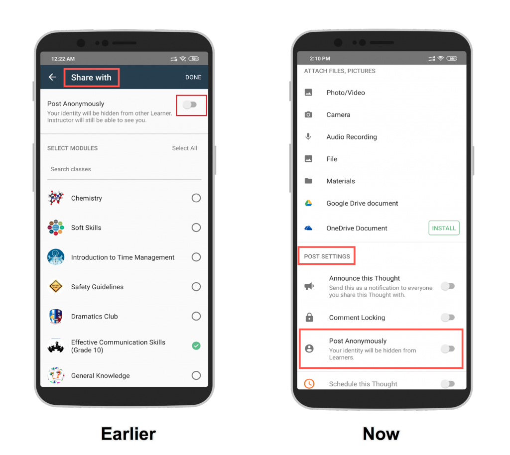
For maintaining consistency, we have moved the Post Anonymously option from the Share with section to the POST SETTINGS section.
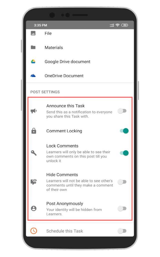
We have also added descriptors for the available settings to assist users in understanding the settings better before they enable them.
Post Creation Revamp (iOS)
The aforementioned features will soon be available in our iOS app as well. Currently, the revamped post creation workflow in iOS includes adding and structuring content along with the ability to add attachments to your posts in the new user interface similar to Android.
That’s it for this mobile app update. See you soon with a new one 🙂
