Hello everyone! You must be wondering about the inclusion of the word ‘Aero’ in the title of this Teamie blog post. Well, let us end all the speculations!
We have been assigning versions to our releases from the beginning, but honestly this practice was getting a little monotonous. So, we thought why not do something interesting from now onwards. Therefore, all release updates will have a catchy name based on a color, starting with Teamie update 1.24. This being one of our ways to add colors of happiness in your life 🙂
Aero is the color marked for this release. Aero is a color that is closely associated with Air force, so we hope to have a flying start with this approach 😉
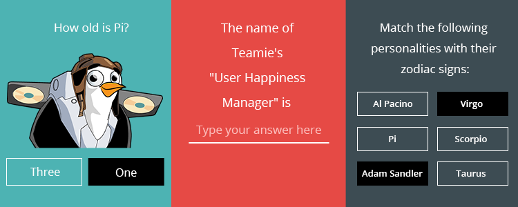
In this update, quiz taking migrates to Dash. This means learners will be able to take quizzes in Dash on their desktop and mobile devices. We have also added one important quiz setting which will enable learners to view correct answers after attempting each question.
Other stuff to look forward to in this update are:
- Gradebook enhancements: The order of assessments in the Materials view will be reflected in the gradebook too 🙂
- Online quiz scores will be recomputed when correct answer changes
- The global Teamie search will now return results for ‘hashtag’ searches
- Instructors can view and download submissions by blocked users without any hassle
So, let’s get into the details. Shall we?
Quiz Taking in Dash
“Life has a way of testing us. Everyday is a new quiz,
And every morning that we wake up is proof that we’ve passed”
Learners are the future of this bright world. But not always do learners like to be quizzed and take quizzes in the same monotonous manner. In truth, they do have a point, and therefore we are introducing an all new Quiz taking workflow. It is as efficient, as it is easy to use.
You can take quizzes from the ‘Materials’ page. All quizzes that need to be taken will have a “Take Now” button in front of them. You can also take quizzes from your To-Dos section. In either scenario, you will land on a brand new Quiz taking page which, by the way, is very informative. So, you don’t need to worry about anything else and just concentrate on giving your best 🙂
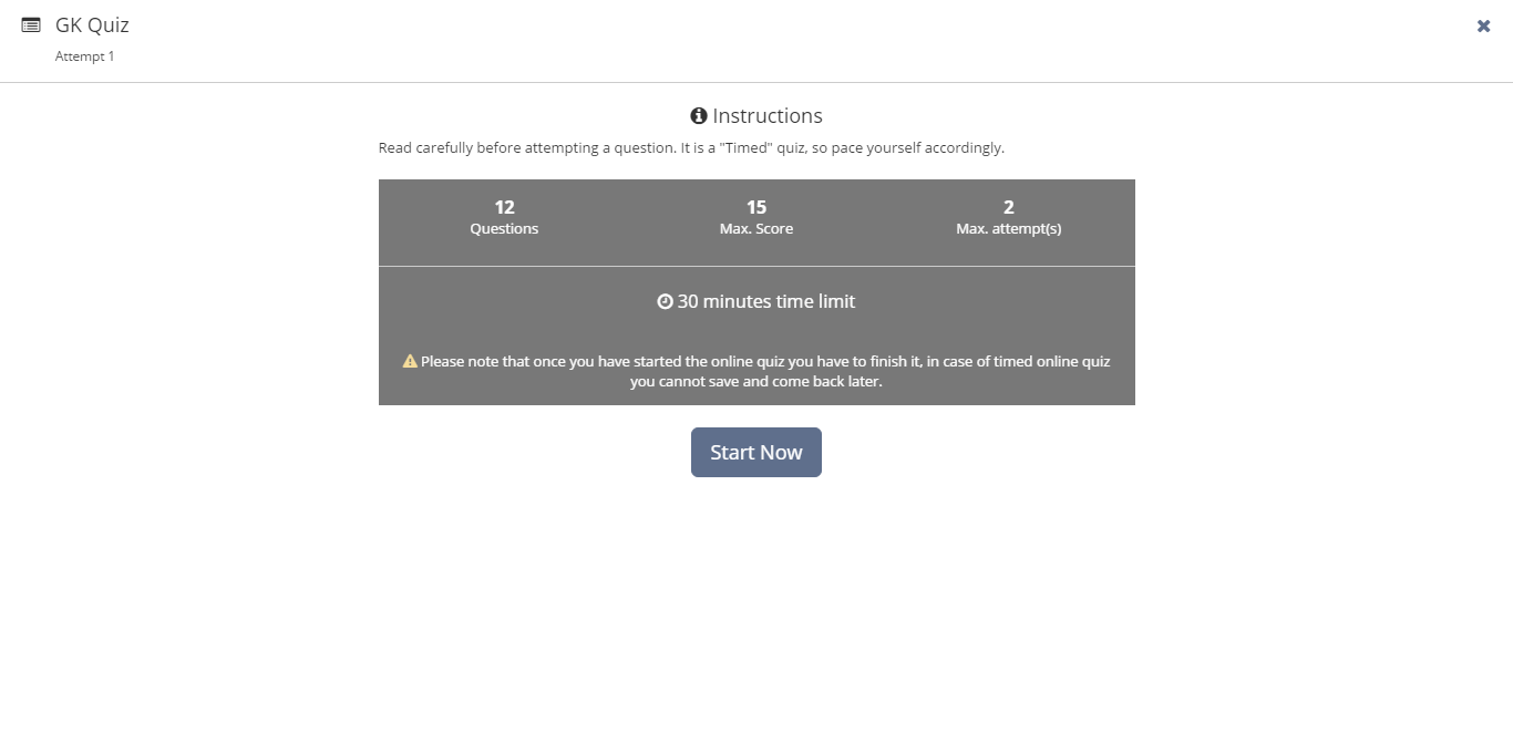
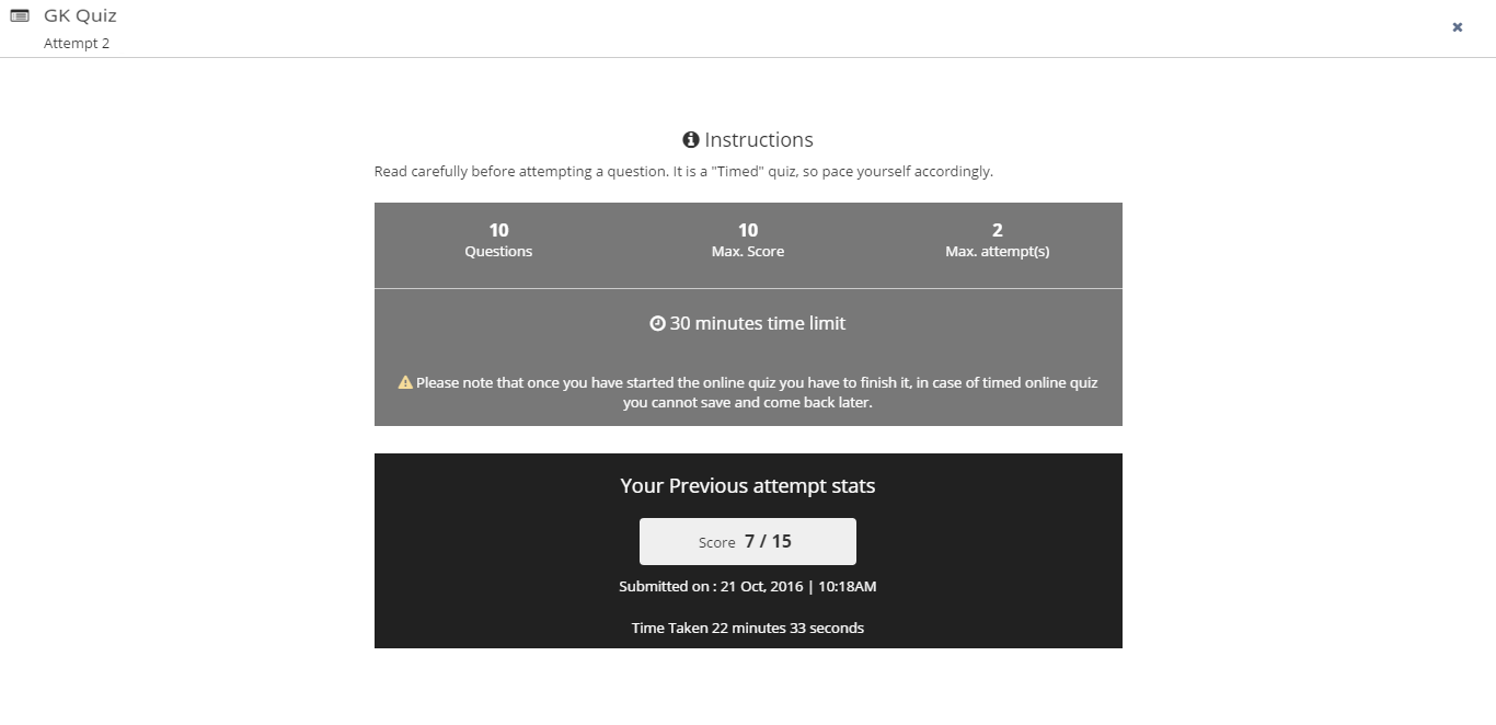
You will straight away notice that the interface is very intuitive and easy to use. One such example being the case where you are taking a quiz that you have already attempted before. You shall view the stats of your previous attempt right at the quiz taking landing page. Also, in the case of a timed quiz, you will be able to view the time taken by you for your previous attempt. This way you can improve on yourself (as they say, “be your biggest competition”).
We have redesigned the question attempt page to make it sleeker, more aesthetically pleasing, and comprehensive. You can find all the information regarding the quiz questions on a single page while taking a quiz. See for yourself:
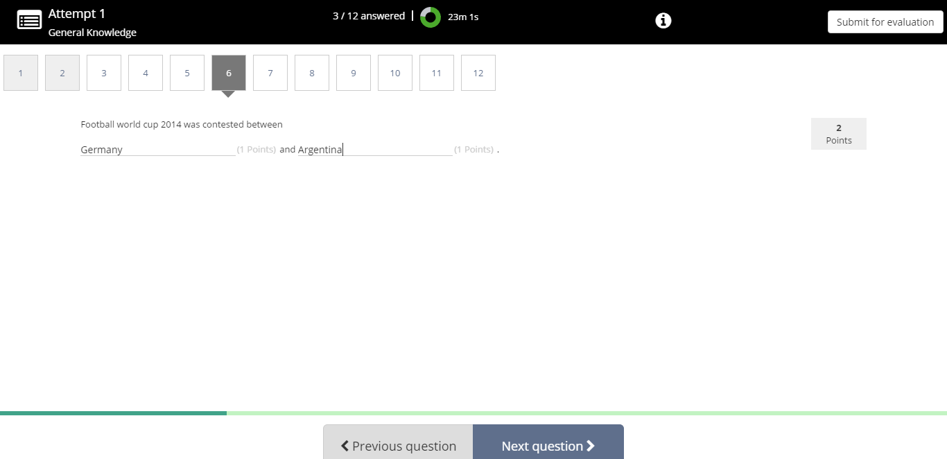
As you can see, the top bar contains important information regarding the quiz, such as the title of the quiz and the number of attempts made for the quiz. You can see how many questions you have finished answering along with a timer in case of a timed quiz. All the questions will be placed just below the top bar. You can click and attempt any question in desired order (if allowed by the quiz creator). The attempted questions will be highlighted and you can easily make out which questions are unattempted.
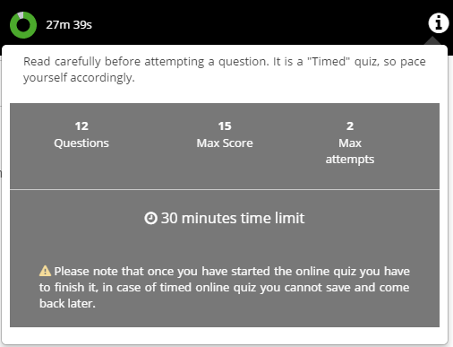
Quiz takers can access instructions given by the quiz creator along with all other settings by clicking “i” icon in the top bar.
You can navigate to the next and previous question by using the navigation buttons in the bottom bar. The bottom bar also accommodates a nifty progress bar that will serve as a visual indicator of your progress.

Additional Quiz Settings
Based on client feedback, we have introduced an additional quiz setting, “After attempting each question”. Instructors can enable this under the “Submissions” section of the settings, under “View correct answers”.
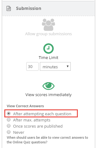
Selecting this option will allow learners to see the correct answers after attempting each question along with the right/wrong answer feedback. This can be useful if the instructor has created the quiz with the sole motive of helping learners practice and strengthen their understanding of a concept.
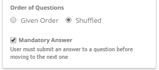
We have also tweaked “Mandatory Answer” setting. Now, learners can answer the questions in any order i.e. he can move from first question to second without answering it but can come back to the first question later and answer it before finally submitting. But the learner would not be able to submit the quiz (with “Mandatory’ Answer” setting enabled) without answering all the questions first.
This means that the “Mandatory Answer” setting can now be used along with the “Shuffled Order of Questions” setting as well, i.e. if there are 20 questions that are shuffled and presented, the learner needs to answer all of them before submitting for evaluation. As we said, we had it before, we just tweaked it to be better 🙂
Gradebook Enhancements
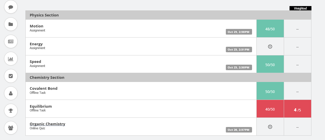
We introduced the concept of the ‘Sections’ in one of our previous releases, which allowed instructors to create an interspersed list of lessons and assignments on the Materials page in Teamie.
So, we felt that the order of assessments in the Materials view should get reflected in the gradebook too. This will be a great help for instructors as their assessments will be displayed in the same order on the gradebook as listed on the ‘Materials’ page. You can apply filters as usual in your gradebook, the order of the filtered assessments will still be retained 🙂
If you have more than one ‘Sections’ on your ‘Materials’ page (which by the way is the most efficient way to organize your content), a bar will appear over the assignment titles to show the corresponding Sections to which they belong (This applies only for sites with “Grading Component” feature disabled).
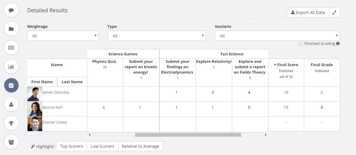
For your ease, there is a filter available on the gradebook page by which you can filter assessments on the basis of the Sections they belong to.
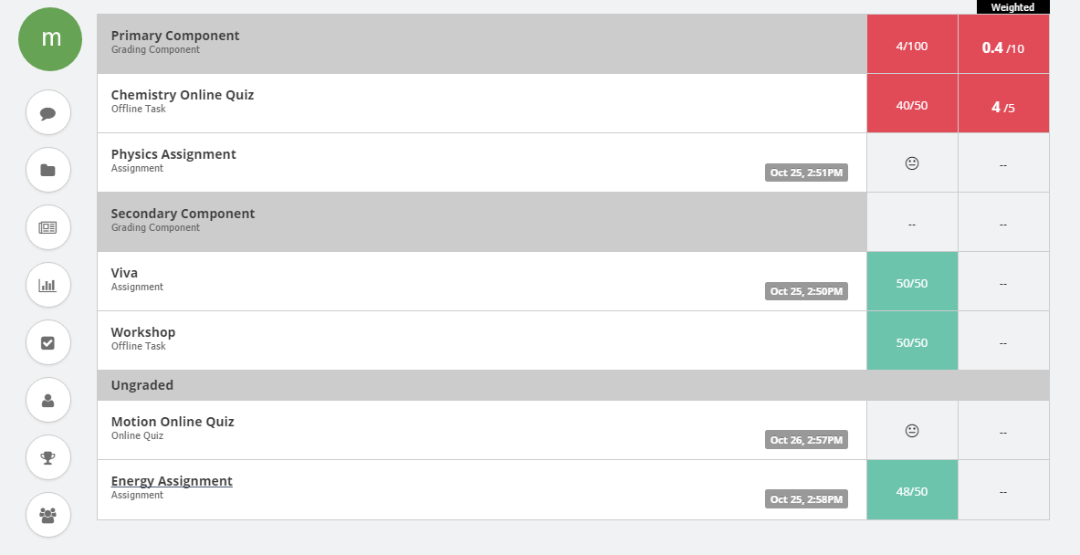
In case your site has the “Grading Component” feature enabled, then you will see the assessments grouped on the basis of grading components and will appear in the same order as that of the grading components on the site.
You will see links for “Allocating grading components” and “Managing grading components” to manage grading components on the site – level and classroom – level respectively.
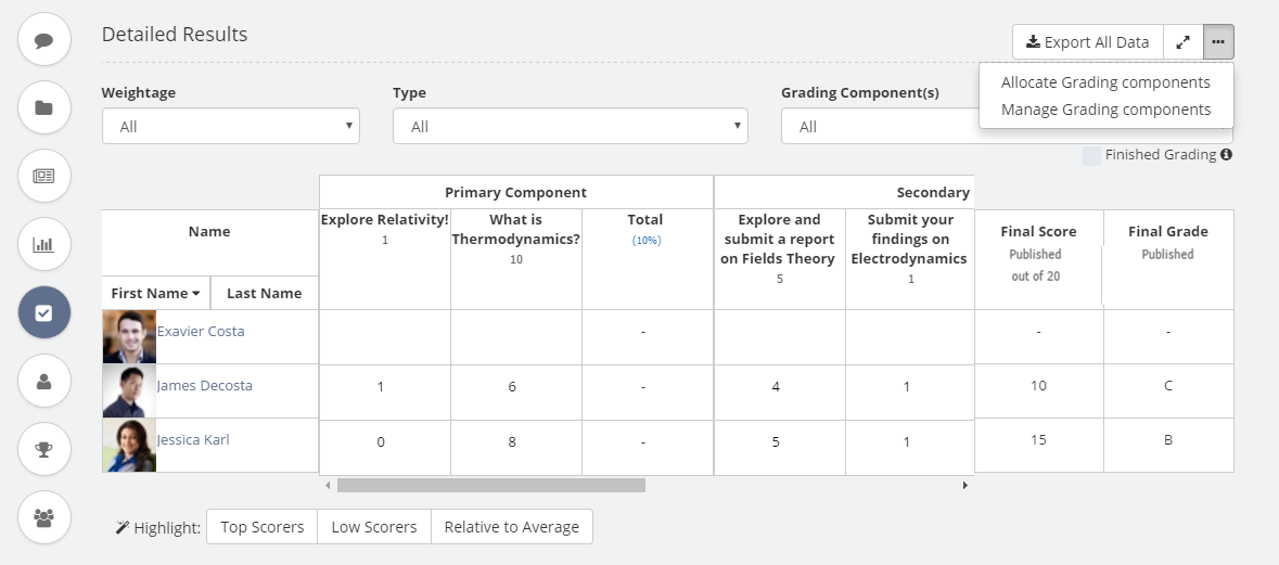
Moreover, the order given to assessments on the “Allocate Grading Components” page will also be retained on the gradebook page. You will be able to easily make out the grading components to which your assessments belong to with the help of the bar positioned above the assessment titles.
Instructors can sort assessments on the basis of a classroom’s grading component with the help of a “Grading Components” filter.
You will also notice a small but important tweak on the gradebook page. The titles of assessments will be wrapped up to 4 lines in the assessment title column. This basically mean instructors get to view full assessment’s title as soon as they access classroom gradebook page 🙂
The above changes will reflect in the learners gradebook accordingly.
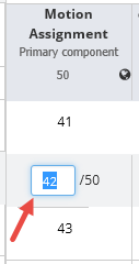
Another minor enhancement that will catch your attention is the improvement in the score editing workflow. When an instructor clicks on a cell to edit a score, or if the user presses tab key from another cell to navigate between cells, then the existing score will be automatically highlighted and the instructor would not have to select a score, delete it and then enter the new score.
This is a small step which will gain us appreciation among instructors. We would also like to mention that this was a client request, and we really appreciate and value your suggestions. Feel free to share your feedback and suggestions with us at support@theteamie.com
Minor Enhancements
Online quiz scores to be recomputed when correct answer changes
Sometimes, there arises a need for instructors to change the correct answer of a quiz question. This may be the case when the correct answer set by them for some quiz questions are incorrect (anyone can make mistakes, even instructors!).
Instructors would feel the need to rectify this situation as soon as possible, regardless of the learner submissions. Changing the correct answer of a question should automatically recompute the scores based on the new correct answer, and that’s what it will be from this release onwards.
Moreover, you will get an additional message while saving the quiz after changing the correct answer, “n users have already made submissions to this quiz. Please note that their scores will be updated accordingly.” This way you will be well informed before making the decision to edit the quiz.
This will also serve as a way to override the scores assigned by auto-grading in quizzes. One such scenario can be One Word question in a quiz where instructors might realize later that the question set by them could have more than one correct answer and the auto-grading is quite harsh for some learners. It’s never too late to correct yourself!
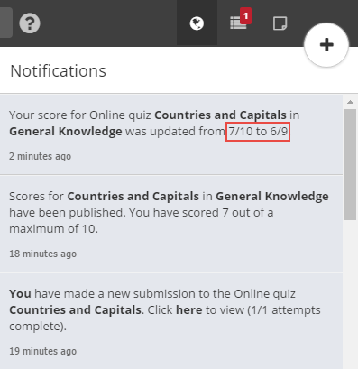
And don’t worry about notifying the learners, we have got that covered too! If there are students who have already made submissions to the online quiz and their scores have been published, then Teamie will notify those students about the changes in their score.
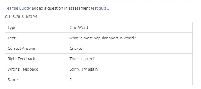
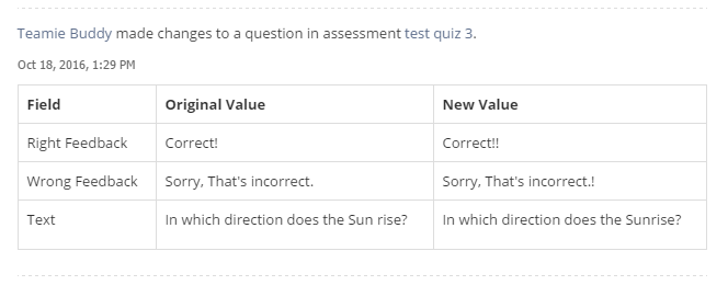
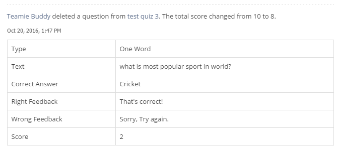
Teamie will also track any changes made to the quiz questions (even when the quiz is in draft state). Instructors can track these changes easily from their profile’s activity stream.
An activity stream entry will be made whenever a question is created, modified or deleted. You will be able to view the changes in the form a table right below the timestamp of the corresponding activity stream entry. This will aid to view the changes quickly.
Teamie Search Enhancements
The global Search on Teamie ‘was’ missing a key component; searching by a hashtag. Now it will run more smoothly and open up even more collaborative learning opportunities on the platform. So, all those social people out there can continue creating content with hashtags without being worried about searching them.
Though a simple hashtag search you can connect with others inquiring into similar themes and concepts, collaborate, widen the dialogue and thus deepen understanding.
For instance, if you search for motivational quotes with #Motivation, all you need to do is type “#Motivation” in the search bar and you will be able to see the content tagged with the hashtag.
You can also use some smart operators to execute a much more precise search, such as posts with #chemistry, comments with #chemistry etc (Read our blog post to brush up your searching acumen).

View and Download Submissions by Blocked Users
Earlier instructors and administrators were having some problems accessing submissions from blocked users as the downloaded submissions for a quiz / assessment didn’t include submissions from the blocked users.
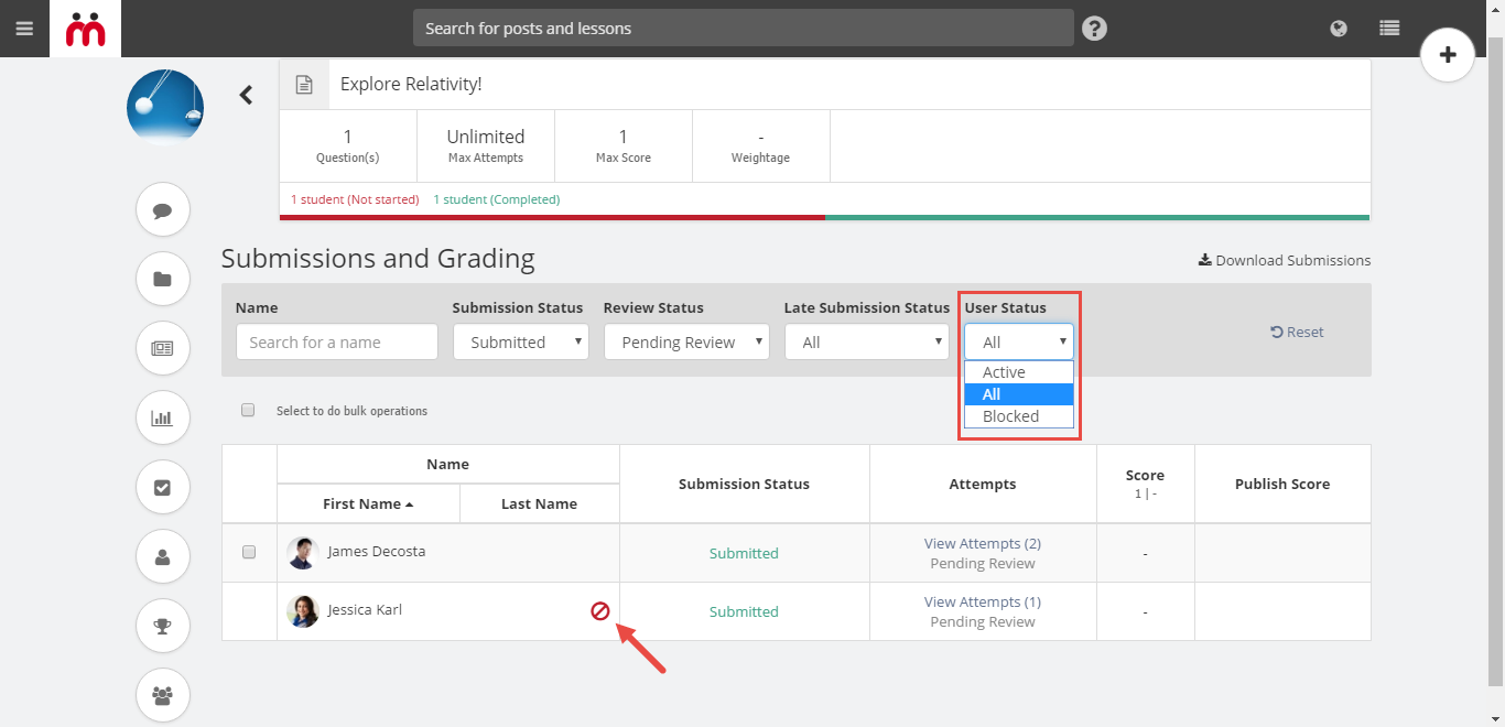
The workaround of getting these submissions was quite a bit tedious and therefore we decided to do something about it. Now not only you will be able to download submissions from blocked users, but also view blocked users on the submission listing page.
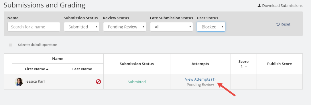
The blocked users in the list will also have an icon distinguishing them from other users. You will also notice a late submission icon distinguishing the users who have made late submissions. We even got a filter for you to sort the blocked users quickly.
You can click “View submissions” of a blocked user from the Materials view of any classroom and then click on “View attempts” link to immediately view his / her submission.
That’s it for this release. We will be back with more exciting stuff in our next release. Take care and keep flying!
