Hello everyone! We welcome you to our latest update, Teamie Gomeisa (2.6). This update focuses on making enhancements to our existing workflows in order to cater to your needs more effectively. Let’s look at the TL;DR version of this update, before we dive into the details:
- Assessment grading and submission enhancements
- Option to set classroom specific default tab
- Offline test with test dates to appear on calendar as all day events
- Lessons with due dates to appear as ToDos for learners
- Calendar events information now logged in corresponding activity streams
- New site-level permission to allow users with specific roles to view any user’s calendar
- Team members list to be shown for group submissions in assignments
- Fill in the blank quiz question enhancement
- Enhancement for newsfeed images
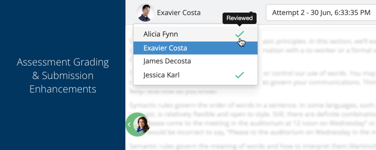
Assessment grading & submission enhancements
We have made some subtle yet effective enhancements to our grading system. As an instructor, this would save your time even more during grading of assessments (assignment & quizzes). We have also improved our file uploading workflow.
Attempts page
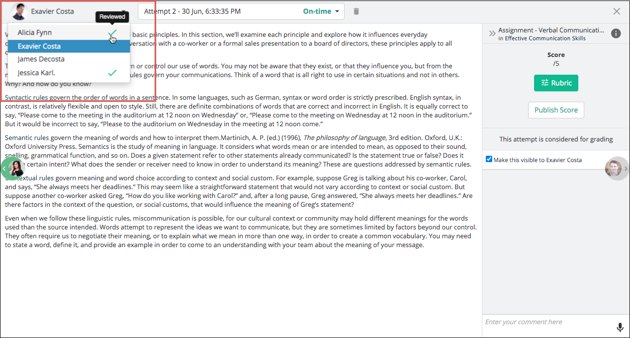
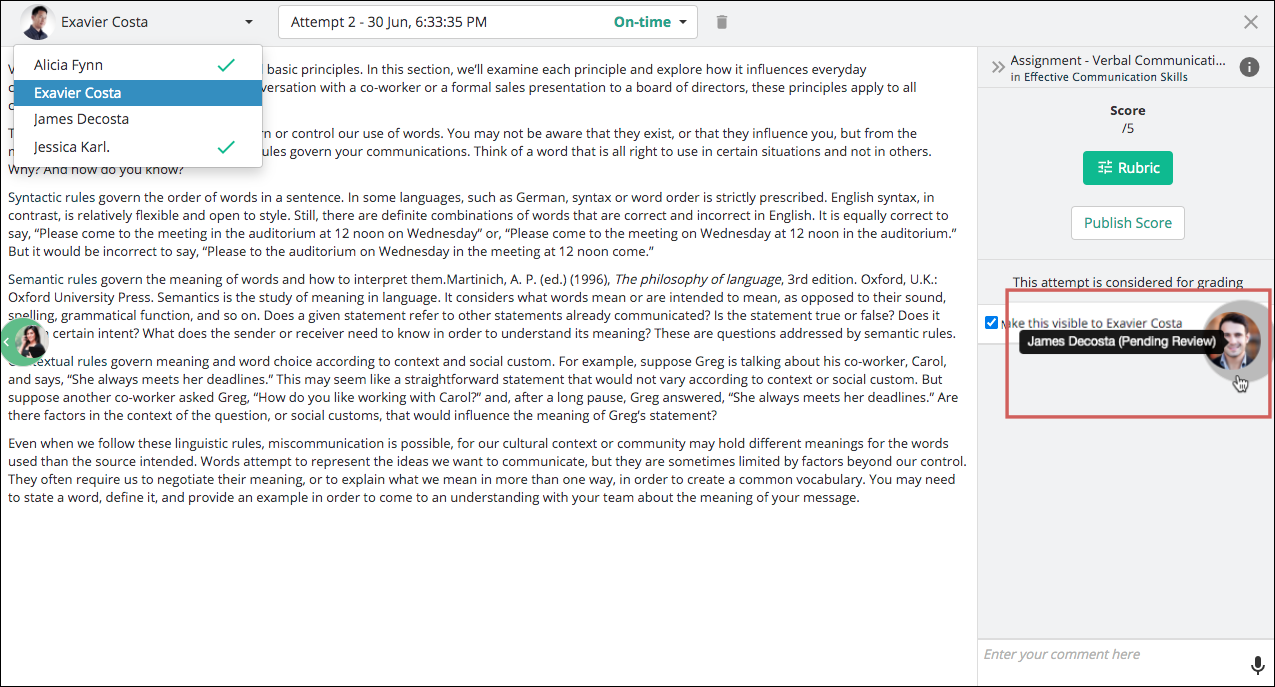
The existing learner attempts page had a dropdown with the list of learners who have made attempt(s). Although this helped instructors in quickly viewing the learners who have made attempt(s) and navigate to any learner’s attempt from there, it didn’t provide any visual information as to which learner’s attempt they have already reviewed.
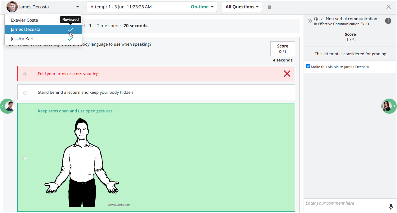
Therefore, we have added a tick mark to indicate the learners’ attempts that have already been reviewed. This means that instructors will be able to view the attempts that have not been reviewed by them from the dropdown itself and quickly navigate through them.
As aforementioned, this change is applicable for both assignment and quiz submissions.
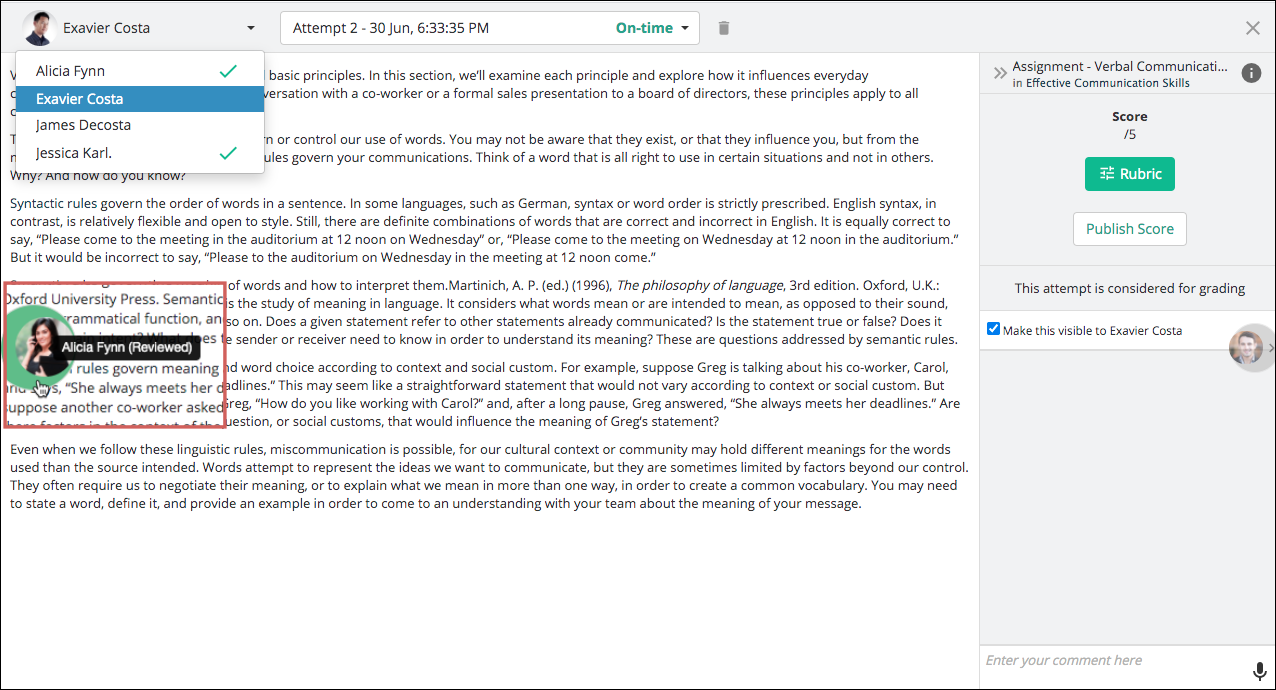
The learner attempts page also had navigation icons for the next and previous learner’s attempt. We have enhanced those to indicate if the next or previous learner’s attempt is already reviewed or is pending for review. This is done with the help of a tool tip that will show the review status of the next/previous learner’s attempt. Furthermore, if a learner is already reviewed, their next or previous navigation icon’s background color will be changed to indicate the same.
Submissions page
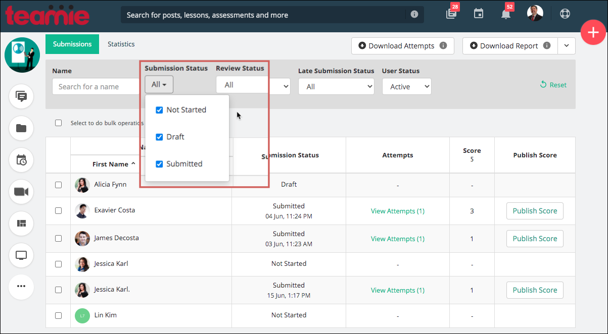
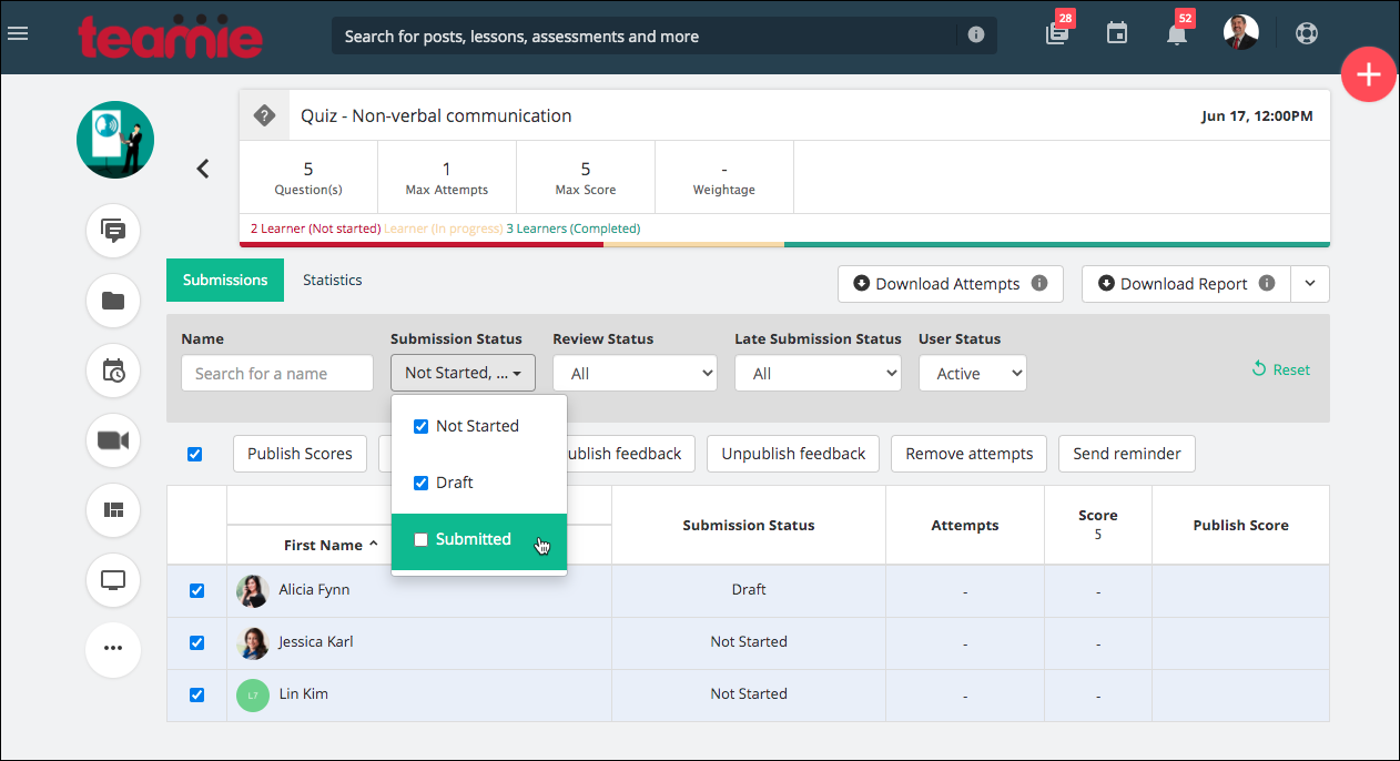
We have enhanced the existing Submission Status filter from single select to multi select. This means that instructors will be able to select more than one status (Not Started, Draft, Submitted) to filter out corresponding learners’ submissions.
This will help instructors select multiple combinations, such as selecting learners with Not Started and Draft status and send them reminders to complete the assessment. By default, all the status will be selected.
Uploading enhancement
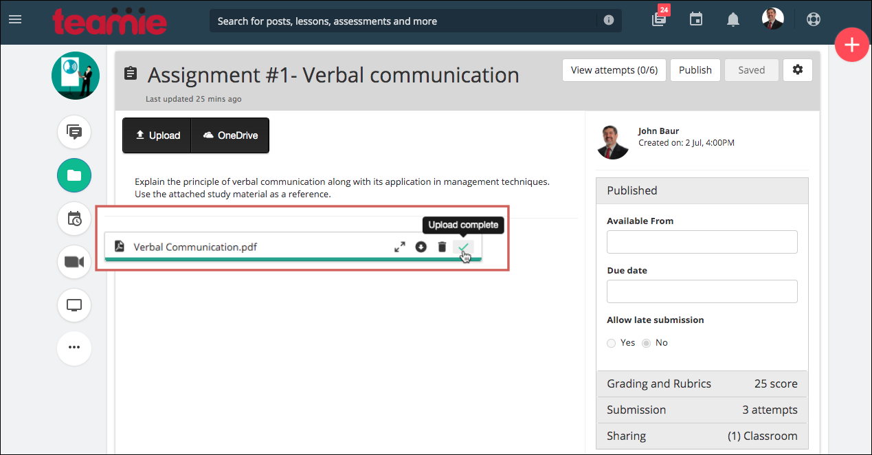
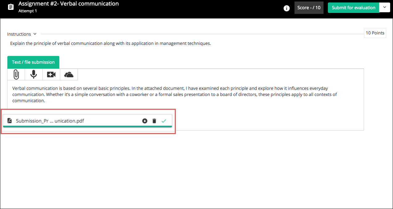
A green bar used to fill up as per the status of the file being uploaded by a user. Once the upload completed, the green bar used to disappear. In case the upload is fast or is missed by the user, then it can leave the user unsure of the upload status. To counter this, we have decided to keep the green progress bar, even after the upload is completed. Furthermore, a tick mark is added with a tooltip to communicate the successful upload of the file to the user.
We hope these enhancements improve the grading and submission experience of our users. Write to us or give us a shout-out in case these changes improve your learning experience!
Option to set classroom specific default tab
In one of our past updates, we introduced a configuration for setting the default tab for classrooms at site level to set the tab (Post / Materials / About) to which the users should be redirected to once they access their classrooms. This was welcomed by our clients as they could direct users to the required tab with one less click (e.g. from Posts tab to the required tab).
In order to customize the experience even more, we have extended this functionality to allow instructors to set the default tab at the classroom level. This means that instructors can choose to direct users to different tabs for different classrooms, at their own discretion.
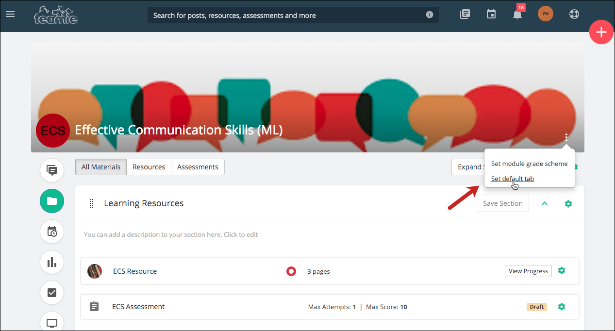
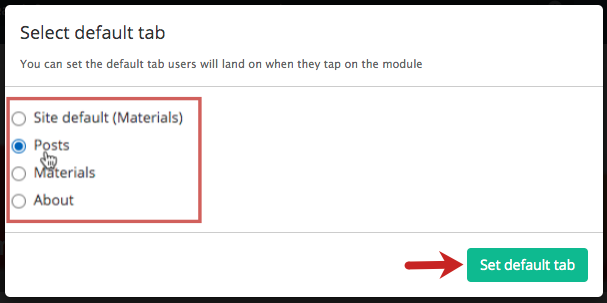
Instructors can access this setting from the ellipsis on the classroom cover image. Once they click the Set default tab setting, they will be shown the options that are available for them to select as the default tab of that classroom. They will also be able to see the configuration that is set as the default tab for classrooms at site level. They can choose the required tab to be set as the default and click the Set default tab button.
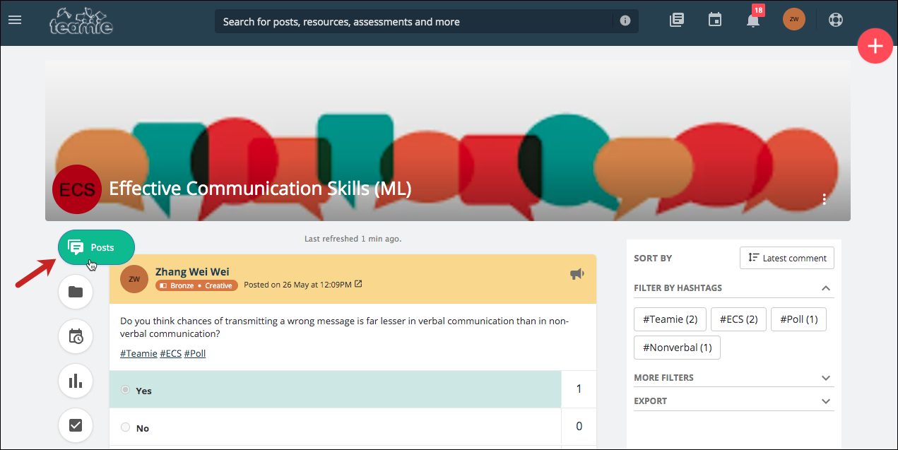
The selected tab will be set as the default tab for that classroom. Now, all the users will be directed to this tab when they access the classroom.
Offline test to appear on calendar
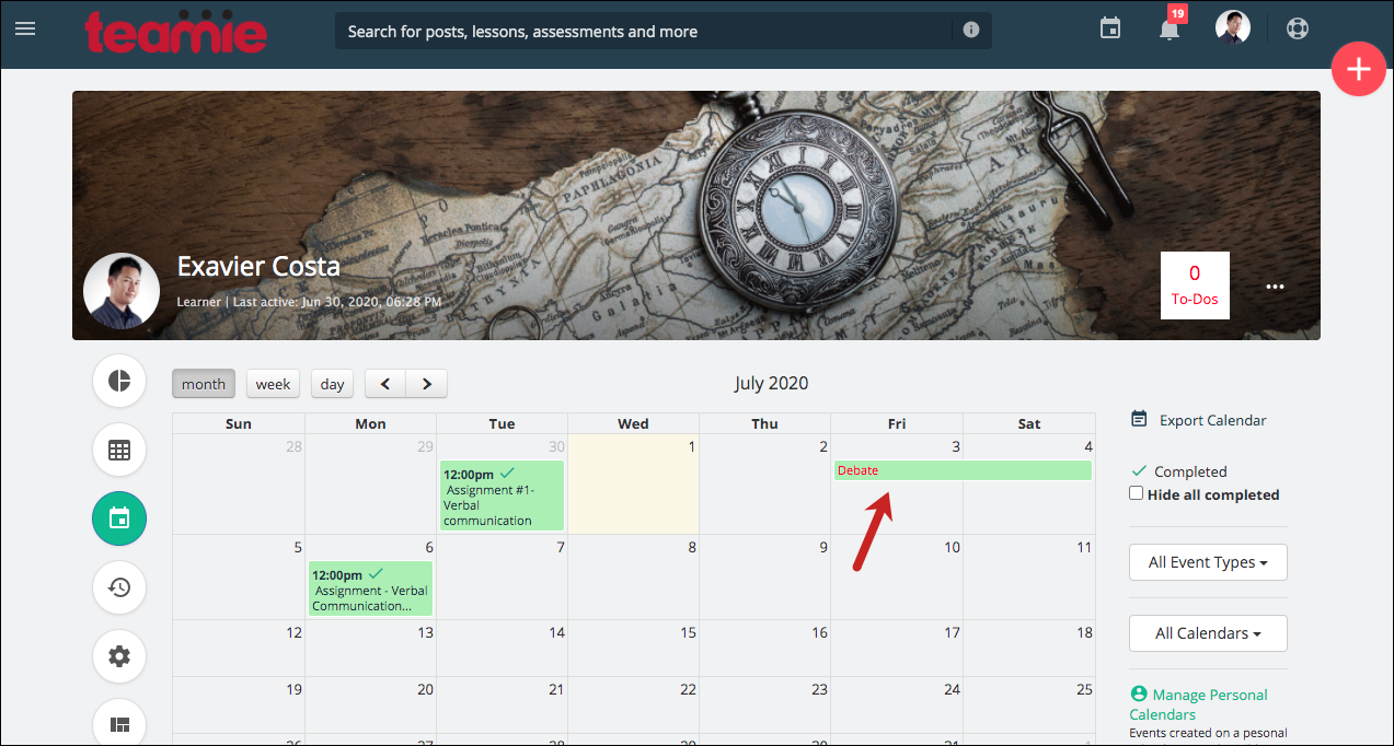
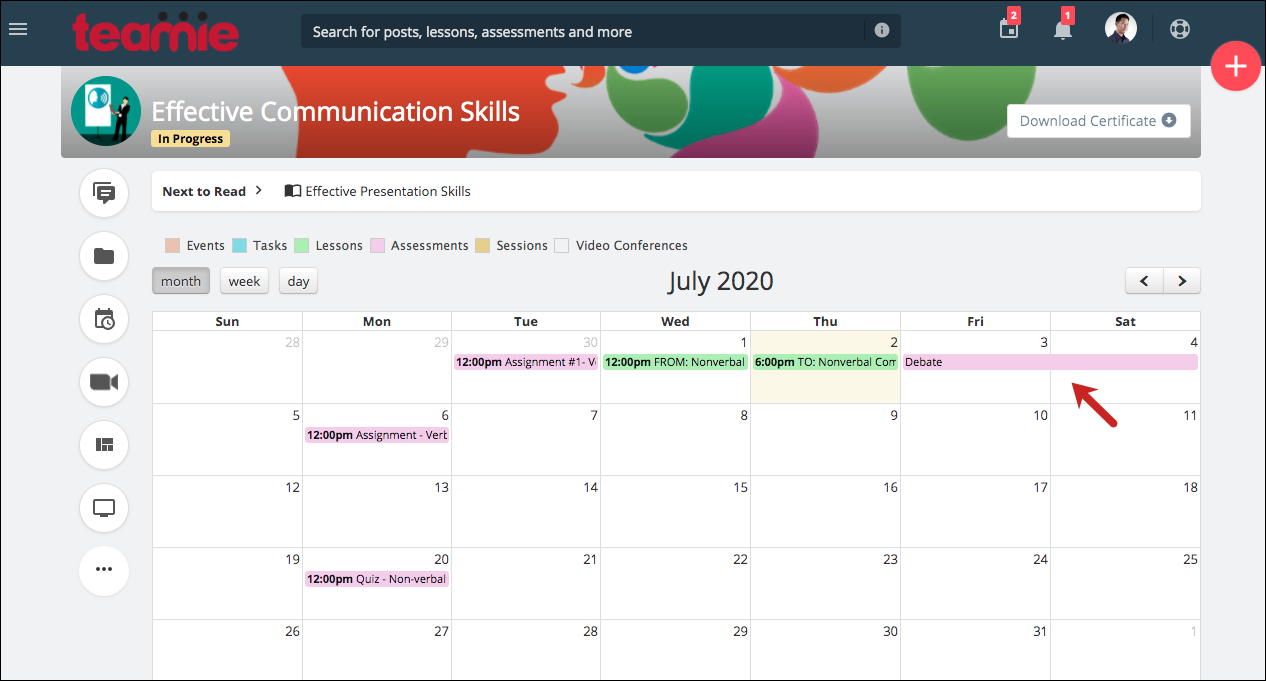
Offline tests with test dates will now appear in the calendar as an all-day event. This can be useful in case instructors wish to make offline tests ahead of time and keep learners apprised of them using the calendar events along with any standards by which they will be assessed while being able to see the attached rubric, if any.
| ? In case the offline test dates span multiple days, it will appear as an all-day event on all those dates. |
User Calendar
Classroom Calendar
Lessons with due dates to appear as ToDos for learners
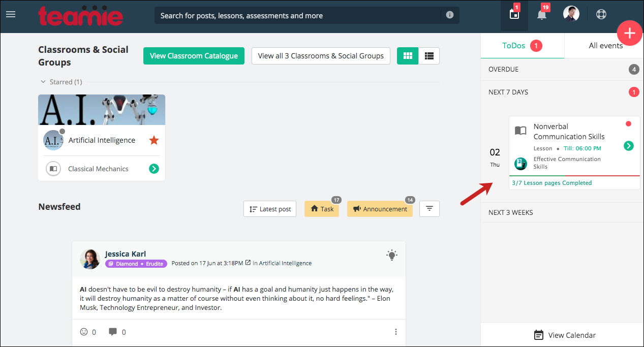
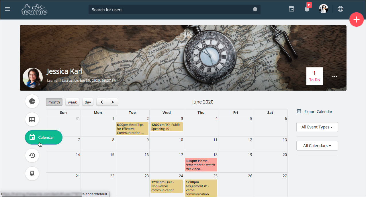
Earlier, lessons from and due dates were shown as ‘All Events’ in the learner calendar. We have now made changes such that the lessons with due date (deadline) will be shown as ToDos for learners. Similar to assessment, the lesson ToDo will be considered as completed when learners have read all the published lesson pages of the lesson. In case an instructor adds a new lesson page to a lesson that is completely read by a learner, then the lesson will be moved back to the ToDos section.
| ? SCORM lessons will also be included in the ToDos and will be considered as completed once learners complete the SCORM package for the first time. |
Calendar events now logged in activity streams
The user level Recent activities and classroom level Activity Stream serve the purpose of keeping users informed about the activities related to their profile and the activities being performed at the classroom level, respectively (instructor-role users).
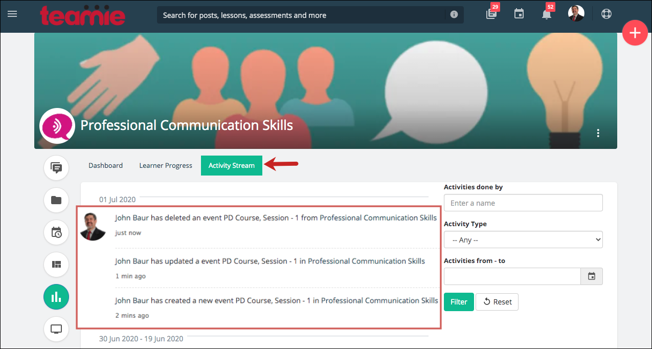
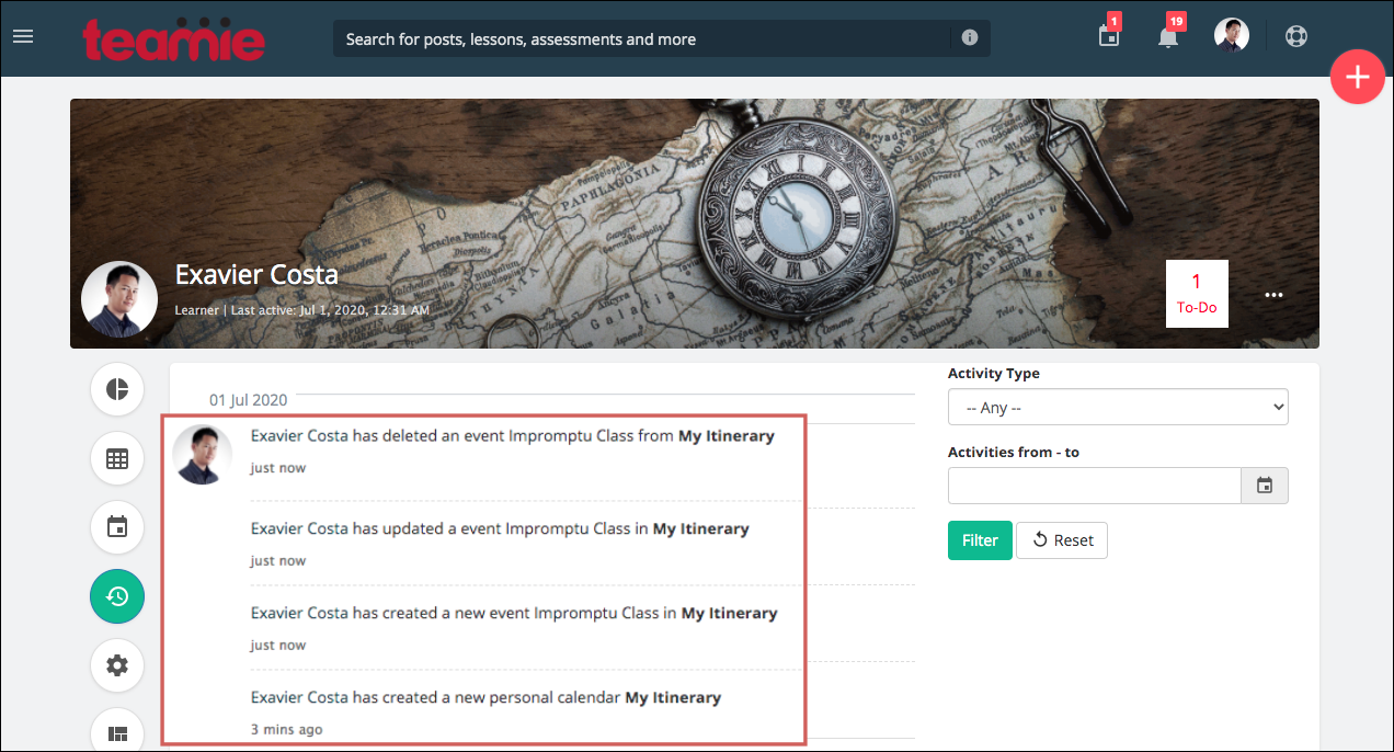
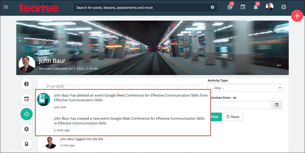
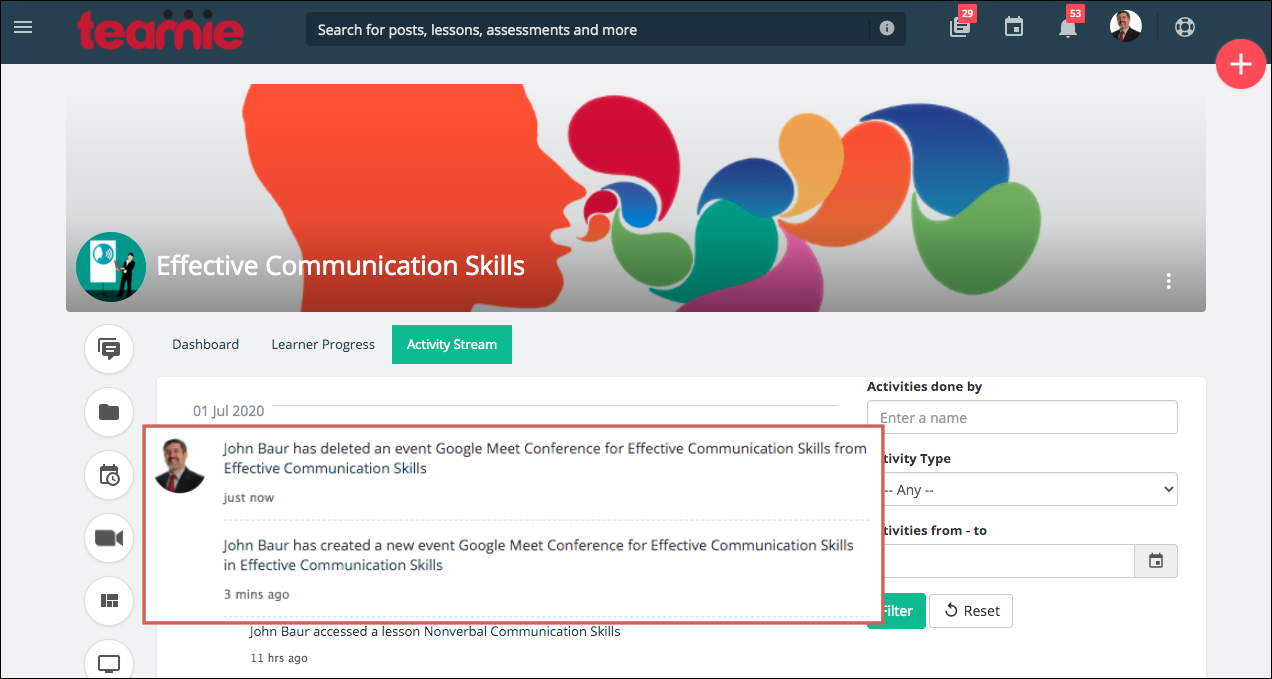
We now log in all the calendar-event related activities in the Activity Stream and Recent activities sections. So, now when a calendar activity is created, updated, or deleted, it is logged in the corresponding activity streams.
Instructors can now see all the changes made to calendar event(s) that are added to the classroom calendar from the classroom’s Activity Stream. In case a calendar event is created for multiple classroom calendars, there will be a separate log created for each of them.
Whereas, all users will be able to view the changes made to the calendar event(s) added to their personal calendar from the Recent activities section on their profile page.
User’s Recent activity tab
The classroom calendar event’s logs will appear in the instructors’ recent activities and the classroom’s Activity Stream. The events with Google Meet conference enabled will also be included in the corresponding activity streams.
New permissions to allow viewing any user’s calendar
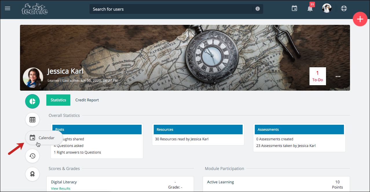
We have introduced a new set of permissions that will allow a predefined set of users to view any user’s calendar from their profile page. This can be helpful for users that are assigned with overseeing a multitude of users and classrooms in administrative capacity. This set of permissions can be enabled for specific roles on request. So, kindly write to us in case you wish to enable these permissions for users of an existing role or a new role.
Team members list to be shown for group submissions in assignments
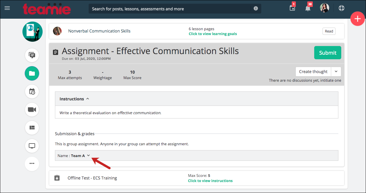
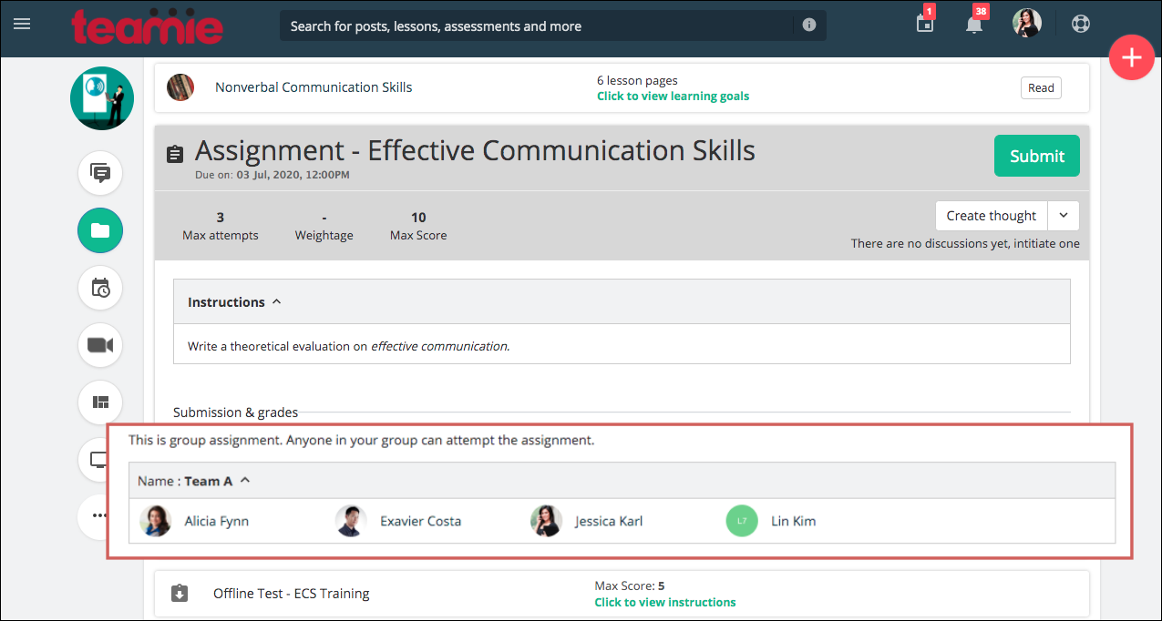
Currently, we show the details of other group members when a learner is making a submission for an online quiz that has group submission enabled. Now, we have extended this information sharing for assignments as well.
Now onwards, when group submission is enabled for an assignment, learners will be informed about the other members of their group. This will be shown in the expanded view of the assignment.
Fill in the blank quiz question enhancement
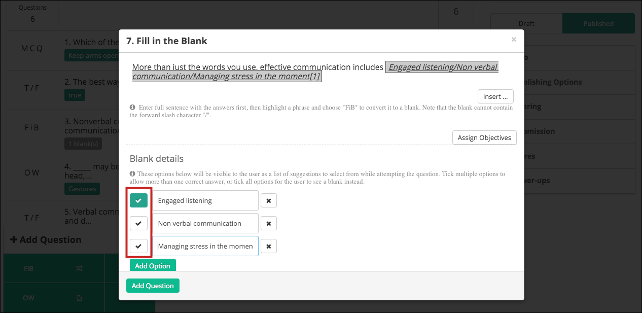
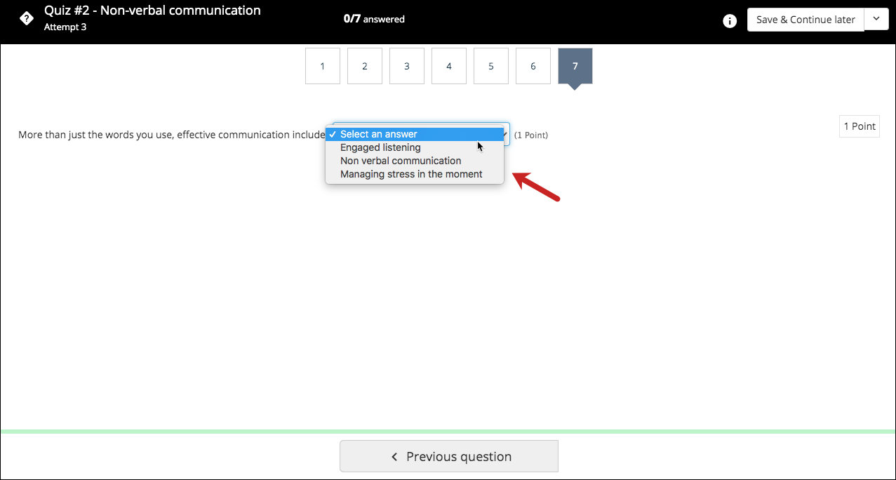
Earlier, if multiple options were added for blank(s) in the fill in the blank question, then a dropdown was shown to the learner while attempting the quiz with all the added options. But, in some cases instructors want to add multiple correct options for a blank and still choose not to show any suggestions to learners in the form of a dropdown.
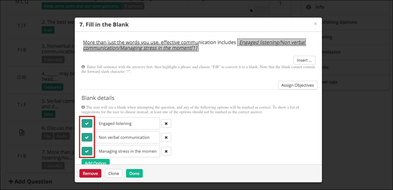
To address this scenario, we have made enhancements to the fill in the blank quiz question. If an instructor adds multiple options for a blank and not all of them are marked as the correct options, then a dropdown with all the added options will be shown to the learner while attempting the question.
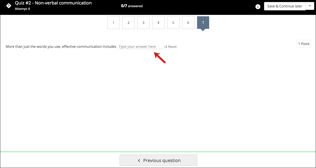
But, in case the instructor selects all the options as the correct option for the blank, then a blank will be shown to the learner to fill the correct option. This is similar to how the one-word quiz question with multiple options is shown to the learners.
So, we hope we were able to cater to the needs of our clients with this enhancement and help them create and grade quizzes more productively 🙂
Enhancement for Newsfeed images
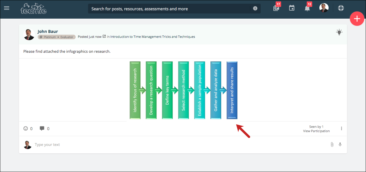
Sometimes, images are uploaded in posts that do not provide the best viewing experience to the users who are consuming the content. One such scenario is when the image attachments are uploaded with incorrect orientation.
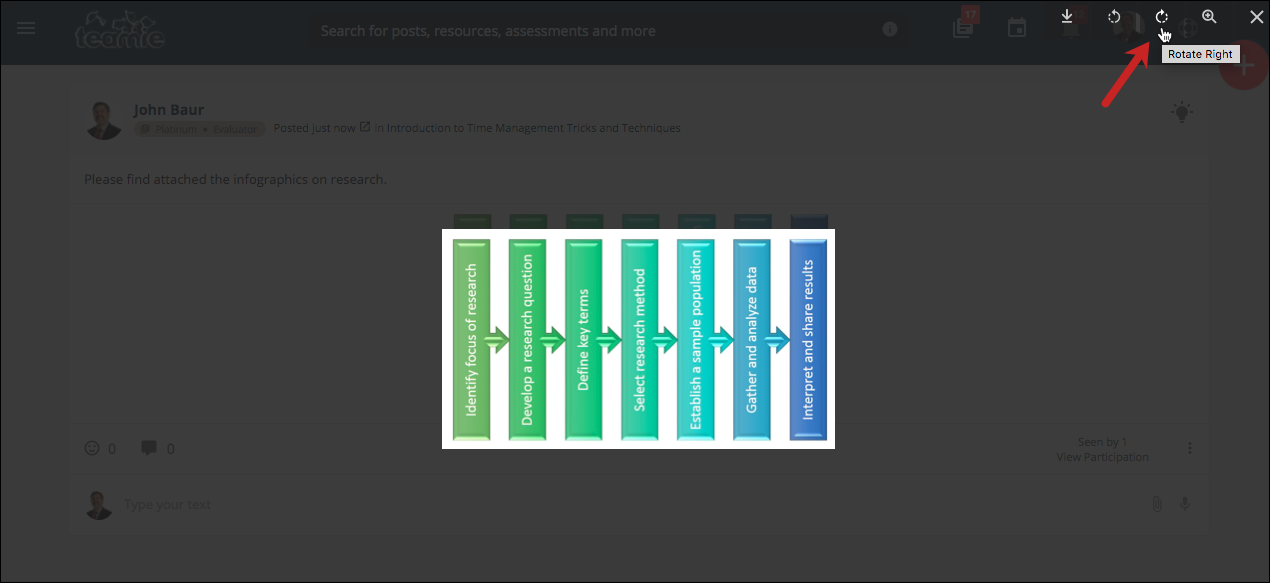
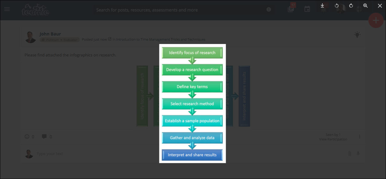
To improve users’ viewing experience, we have added an option for the user to rotate any image attachment added to a post on the newsfeed when they are viewing the image. Once a user taps to open an image attachment, they will see the option to rotate the image clockwise or counterclockwise in 90 degree increments.
So, that’s it for this update. We hope these enhancements will help cater to the ever-evolving needs of today’s learning. See you soon! Till then, stay collaborative and stay healthy.
