Hello guys! We have been away for quite some time now. But we assure you, we are back with something awesome. The much anticipated Teamie app update 3.0 is finally here. This is a big one and will change the app’s look and feel, for good!
Before we dive into the details, let’s first give you a preview for this update.
- Single tap approach for navigating to the predominant sections of the app
- All new classroom listing page to access all your classrooms in a jiffy
- A newly added More screen to efficiently encompass your profile and menu section at one place
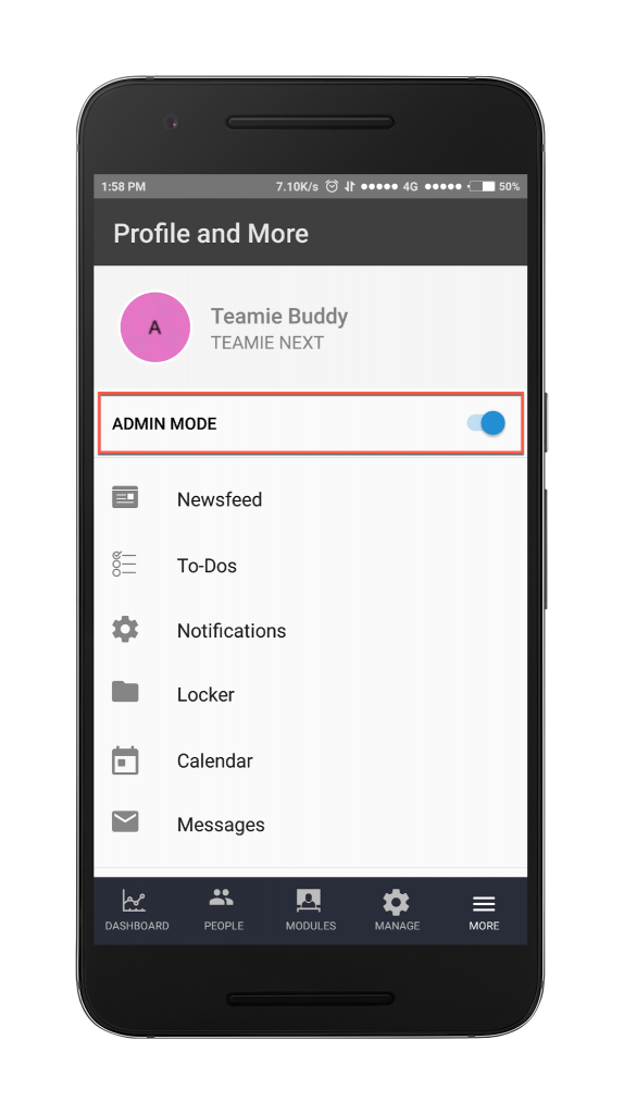
- A nifty toggle for handling multiple user roles
Keep reading for more details.
New Navigation Structure
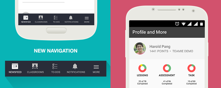
The next time you update your app, which by the way you should regularly do, you will see a whole new navigation structure. We have done a powerful interface overhaul to enhance your experience.
No more hidden menu options, no more scrolling through the sidebar! Everything you need right in front of your eyes.
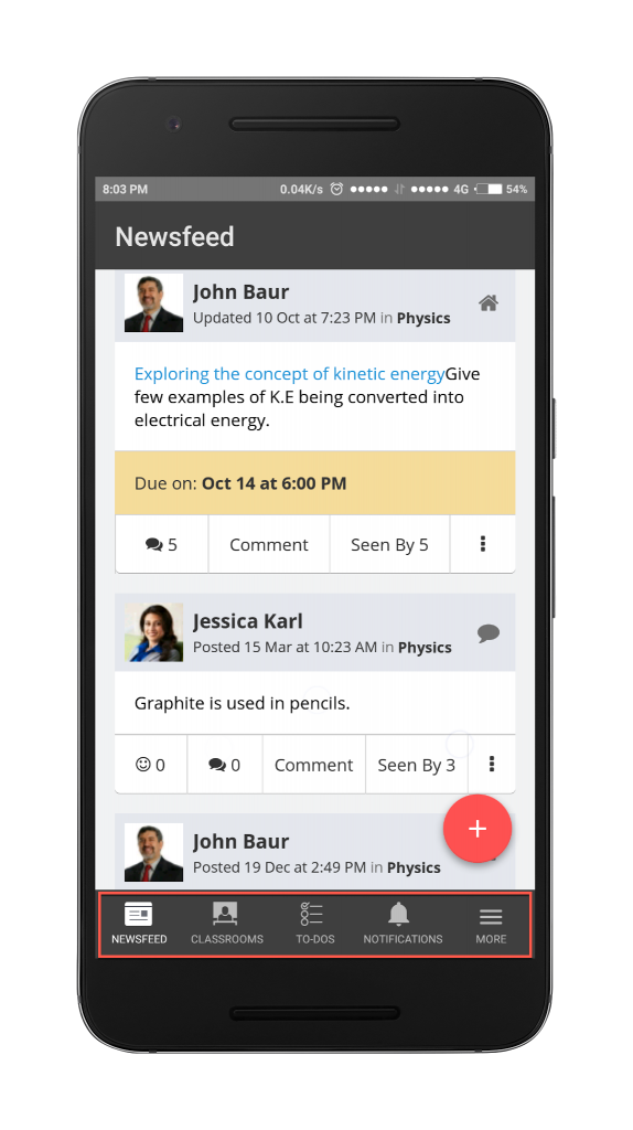
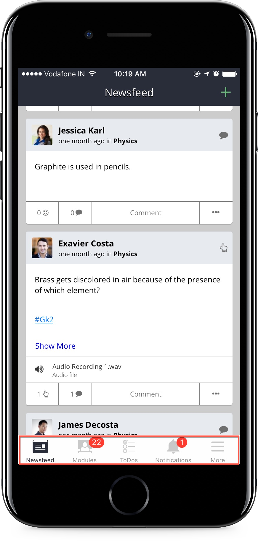
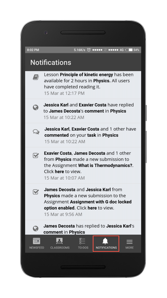
As you can see all the important menu options are accessible from the bottom of the screen. So, you can straight away access the important menu options after logging into the Teamie apps.
Just tapping onto a menu options will take you to the corresponding screen. And to make your experience even better the selected Menu option tab will be highlighted.
The navigation structure will be change according to your role. If you are a parent, then you’ll have access to your children. On the other hand, if you are an administrator you’ll have access to the admin dashboard and the people page.
New Classroom Listing Page
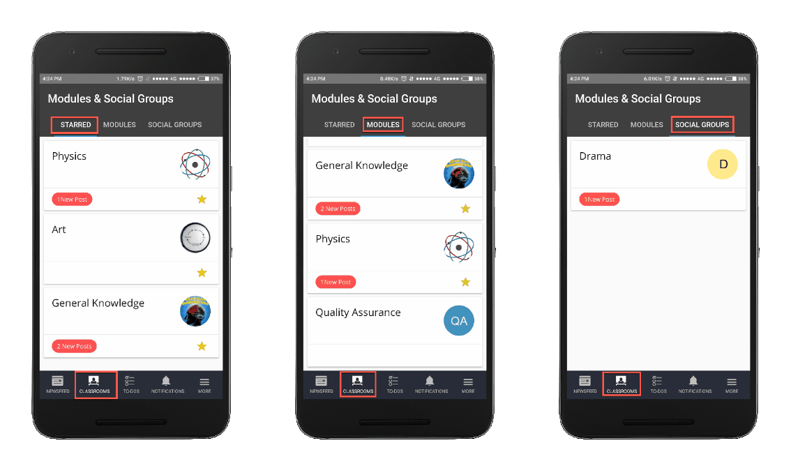
The newly designed classroom listing page will comprise of all your classrooms and social groups along with a section dedicated to your starred classrooms.
You can easily navigate to and fro between these pages with a swipe of your finger.
This way you can access your starred classrooms or any of your classrooms and social groups with just a couple of taps. Isn’t it cool!
New More Screen
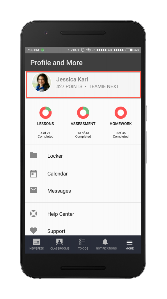
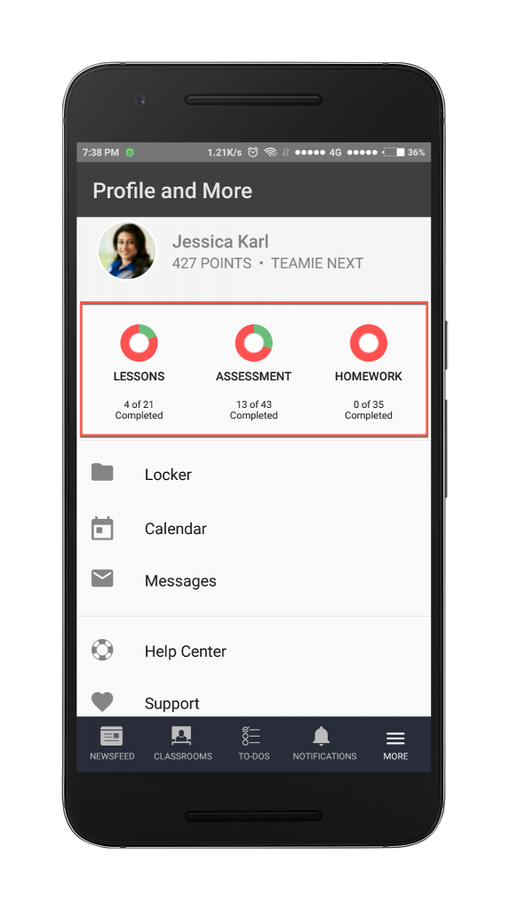
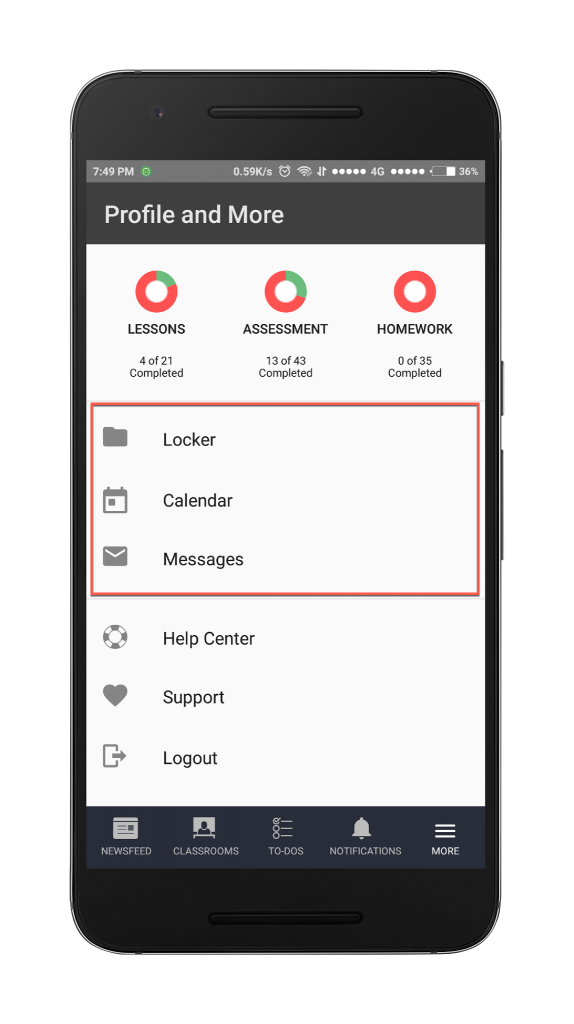
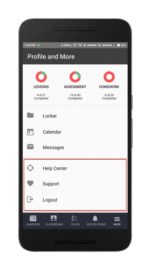
In contrast to the different tab options shown on the bottom bar for different user roles, a “More” tab will be common for all the users. Tapping this tab will take you to the Profile and More page. This page is divided into three sections, namely, the profile section, mini stats section (if you are a learner), and the menu section.
Multiple Role Switch Toggle
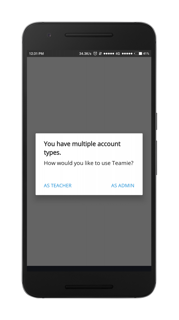
If you are an all-rounder and assigned both the Teacher and Administrator role at the site level, then you’ll love this Teamie app update 3.0!
Whenever you’ll login to the Teamie app, you will be prompted to choose between the two roles. Upon selection, the app navigation structure will change to match the role selected by you.
Don’t worry about switching roles. There is no hassle of logging out and logging in again to switch to the other role; we got a nifty toggle for that. Just head to the More screen and you will see the ADMIN MODE toggle using which you can quickly switch between the administrator and teacher role.
Take note that both the Teamie iOS and Android apps are now released. So, for best experience update your Teamie apps as soon as possible 🙂
And Teamie iOS app users, we will be soon having a video for you to showcase the Teamie iOS 3.0 features. So, stay excited and stay tuned!
That’s it for this update. See you soon! Keep collaborating the social and mobile way – the Teamie way 🙂 and if you have any feedback/suggestions, please drop us an email at support@theteamie.com.
