Android – 6.1
Native Learners’ Assignment Attempt View
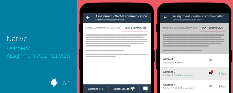
In one of our recent Teamie mobile apps update, we introduced native assignment submission for learners. Keeping in tune with that, our app team has come up with the native learners’ assignment attempt view to access their submitted attempts natively on the app.
Learners can access the attempt view from the Assignments ATTEMPTS screen, VIEW ATTEMPT link on the assignment card in the Materials section, or directly from a notification received on an attempt, such as feedback posted by an instructor.
The assignment attempt view will have the assignment and classroom name on the top. Then the middle section of the screen will have the content added for the attempt. The attempt view can have multiple tabs as per the following:
- If there is a text submission, then the rich-text content will be in a tab titled TEXT SUBMISSION.
- If there are attachments for the attempt, each one will be shown in a tab of its own.
As a learner, you can easily switch between your attempts.
Furthermore, you will be able to view the published score, if any, along with any feedback given on the particular attempt from the Attempt screen. If the assignment has a rubric attached, then a rubric icon will be shown on the right of the score value. This rubric icon will be in green if it has been scored. Tapping on the icon will open the rubric in a full view, showing all criteria and scale details. If the attempt has been marked, the instructor’s graded scales will be highlighted on this view.
iOS – 4.6
Apple Pencil Support for Post Creation (iPad only)
In an endeavour to incorporate the aforementioned advantages of the Apple Pencil to our Teamie iOS apps, we have taken the first step. Teamie iOS app (iPad only) now supports Apple Pencil (both generations) while adding a post. While creating a post, iPad users will now have the option of adding a Pencil Canvas attachment.
The Pencil Canvas screen opens. Use the different options to write or draw the required content.
You can use various features placed at the bottom of the screen such as choose different pencil styles, highlight the objects on the screen as well as change their colour from the given colour palette.
Once you are done on the Pencil Canvas screen, you can just tap Done and the canvas will get attached to the post as an image attachment. As simple as that! You can also tap it to preview, if required.
Once you are done with the post creation, just tap the Post button and the post will be shared with the attached image.
Apple pencil scribble support is also available in the latest iOS app update. To know more about this feature, checkout this blog post.
So, all you Apple Pencil lovers, all you need to do is update your Teamie app to the latest version and unleash your creativity 🙂
Google Drive and OneDrive File Attachments
Similar to the functionality available on the web, you can now attach documents from external file storage services – Google Drive and OneDrive – to your posts.
Note: This feature is already available on the Teamie Android app.
Once you tap the Google Drive document option under the ATTACH FILES, PICTURES menu, you will be able to select files from the native Google Drive picker.
The selected file(s) will be attached to the post at once.
Similarly, if OneDrive integration is enabled on your Teamie site, you can pick OneDrive files from the native picker.
The selected file(s) gets attached to the post. Additionally, you can easily identify the files from Google Drive and OneDrive with the help of their icons on the attachments. In order to remove an attachment, you can tap on it to open the Edit Attachments screen and then tap the ‘X’ icon for the required attachment to remove it.
Note: In case the OneDrive / Google Drive mobile apps are not installed on your mobile device, an Install button will be present that will redirect you to the App Store.
Minor Enhancement
Comments and Replies Revamp
We have enhanced the look and feel of the comments and replies made on the posts. Once you tap on the comments count on the post, you will be taken to the post full view and scrolled directly to the bottom of the comments section.
The comments and the replies made are distinguished by the shade of grey and white, respectively on the background so that learners can easily distinguish between them. We highly recommend you use the comments and replies on the app and see the difference yourself.
So, that’s it for the first update of the year. See you soon with many more! Till then, stay safe and stay collaborative.
