Over the last few months, we have been reimagining the experience for our users across iOS and Android. We’ve had a roller coaster of a ride and we thought of giving you a sneak peek into the making of version 2.0 of our mobile apps! This is the first in a series of posts covering some of the key points in our journey of redesigning and rebuilding our mobile apps. This post will discuss some of our thoughts and decisions around the overall design. Next, our Android and iOS folks will be discussing some of the key challenges they faced while building the apps for the respective platforms. Keep an eye out for those posts!
Three Musketeers: Web, iOS, Android
“All for one, one for all!”
Consistent user experience
At Teamie, we are striving to build an intuitive, predictable and seamless user experience for our customers. One of the key factors for this is to ensure consistency across different platforms. This was one of our main priorities when we began working on redesigning our mobile apps. Starting with Teamie 1.7.3 (Web) and 2.0 (iOS/Android), we are rolling out these new designs across all platforms. 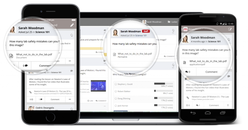 Let’s take a look at the revamped newsfeed screen. This is one of the main screens where we’ve put a lot of effort into making it consistent across web, iOS and Android. We’ve made it easier for you to interact with attachments for posts. Swipe through the images attached to a post or download files for working on/viewing them later. Other enhancements include clear highlighting of due date information for homework posts and handy information to guide discussions in the right direction. For questions, you can see the votes for comments, replies and quickly see the ones marked right by teachers/instructors.
A fresh coat of paint
We are all fans of the colour red at Teamie (no surprise!). However, the colour red does not always signify something positive in the world of user interface design. It’s often the de facto colour used to warn the user about a potentially dangerous action (like deleting something) or alert him/her about critical information. Keeping this in mind, we’ve picked a new set of colours to drive the user interface across web and mobile. Our artists are now armed with a new set of colours and shades to be used in a uniform and predictable manner across the platform. Each colour plays a certain role in the new palette. For example, shades of blue will segregate content and yellow will highlight important information, such as announcements and due dates. This will allow you to focus on the primary information on a screen/page and clearly differentiate between different types of content (comments, replies etc.).
True Mobile Learning
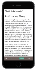
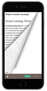
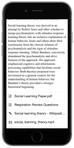
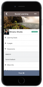
Presenting a new way to view lesson content on phones and tablets! (Available on iOS. Coming soon to Android) We’ve built a distraction free, immersive experience to help you focus on the content at hand, with support for viewing and downloading attachments. Surrounding controls (menu bar etc.) slide away while reading lessons to minimize interruptions and maximize learning. Also, you can swipe through lesson pages easily. Learning’s tough enough to start with. Why make it any tougher? 😉
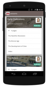
When you view the list of lessons of a classroom, you can quickly tap and see the Table of Contents for that lesson. As an instructor, you can also see which lessons are published and thereby accessible to learners. The lessons, which are in Draft mode and not accessible are highlighted using a “Draft” label.
The New Way to Share Stuff!
A survey with some of our customers told us that they needed a quick way to share stuff from their smartphones with everyone in a classroom. Say, you’re in an English class and you capture the video of a kid (or you!) acting out Hamlet’s soliloquy. There should be an easy way for you to share it with all the other learners in your class.
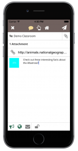
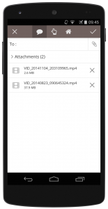
Using the new Post Share feature, you can capture videos and share it instantly with all the people in a classroom. Gone are the days where you need to copy the video to your laptop and then navigate to the Teamie website to upload it.
The power of AWS
The iOS and Android SDKs from AWS played a crucial part in building this feature. Teamie is powered by Amazon Web Services on the cloud. That means, we can leverage AWS’s incredible architecture and SDKs to make our platform and apps even more awesome! The task of uploading files (or the heavy lifting) is handled by the AWS SDK, allowing us to give you lightning fast video uploads and real-time updates on the upload progress to ensure you’re not left in the dark.
Knock, Knock. Who’s There?
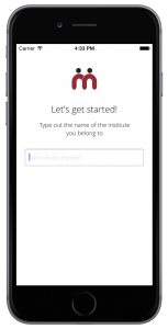
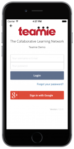
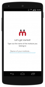
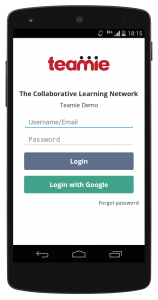
We’ve revamped the steps involved in logging into our mobile apps. In Teamie, the modes of login can be configured for you. Starting with 2.0, our mobile apps will display the login options chosen by your institution/organization. You can simply pick your institution/organization from the list, based on which we will display the relevant options available.
iOS
Android
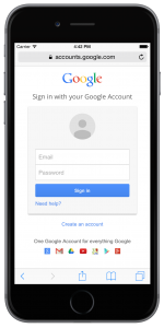
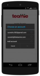
Also, we’ve made the Google login workflow more secure on our mobile apps. We now let Google handle the authentication/verification of the user account. On iOS, you will be redirected to Google to enter your login details directly. Once that completes, you will be logged into Teamie with the chosen Google account. On Android, you can pick any one of the Google accounts set up on your device to login to Teamie. Teamie does not get access to your Google account’s password on any platform. 🙂
There’s Always More!
We hope you have a great experience using the new version of our mobile apps! We will continue to unleash the power of mobile platforms, bringing you more new and exciting features. As always, your feedback is most welcome. If you have any feedback/suggestions, please drop us an email at contactus@theteamie.com.
Version 2.0 of the Android app is out on the Play Store. Stay tuned for the iOS version. Coming your way soon!
