Hello everyone! We are back with our latest update – Teamie Fafnir (2.5)! This update brings a significant homepage revamp in terms of both functionality and design. Furthermore, we have extended our single sign-on options to include Azure AD B2C. Let’s first give you a TL;DR version of this update before we dive into the details:
- Homepage revamp to enhance the layout of classroom cards and ToDos along with the introduction of a single-column newsfeed
- Classroom calendar now available for learners as well
- Teamie – Azure AD B2C SSO integration
Homepage Revamp
We have changed the way our landing page looks! The exciting thing about this revamp is the ability to configure different landing pages for different customers. We have tried to introduce these enhancements without making drastic changes to the existing layout configured for your site. And we have outlined below different options which are now available for site admins to choose from. So, without further ado, let’s jump to different configurations that are now available for the landing page.
Standard landing page
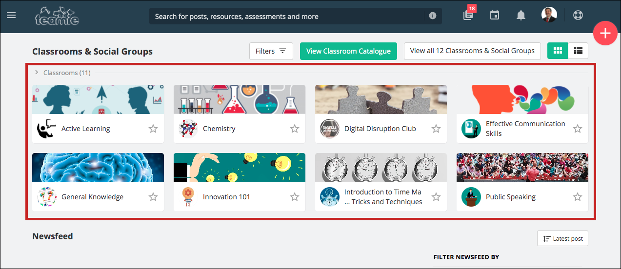
The previous landing page layout used to house three classroom cards in a row along with a two-column aggregated newsfeed. We felt the need to make it more visually impactful and at the same time, more efficient for our users.
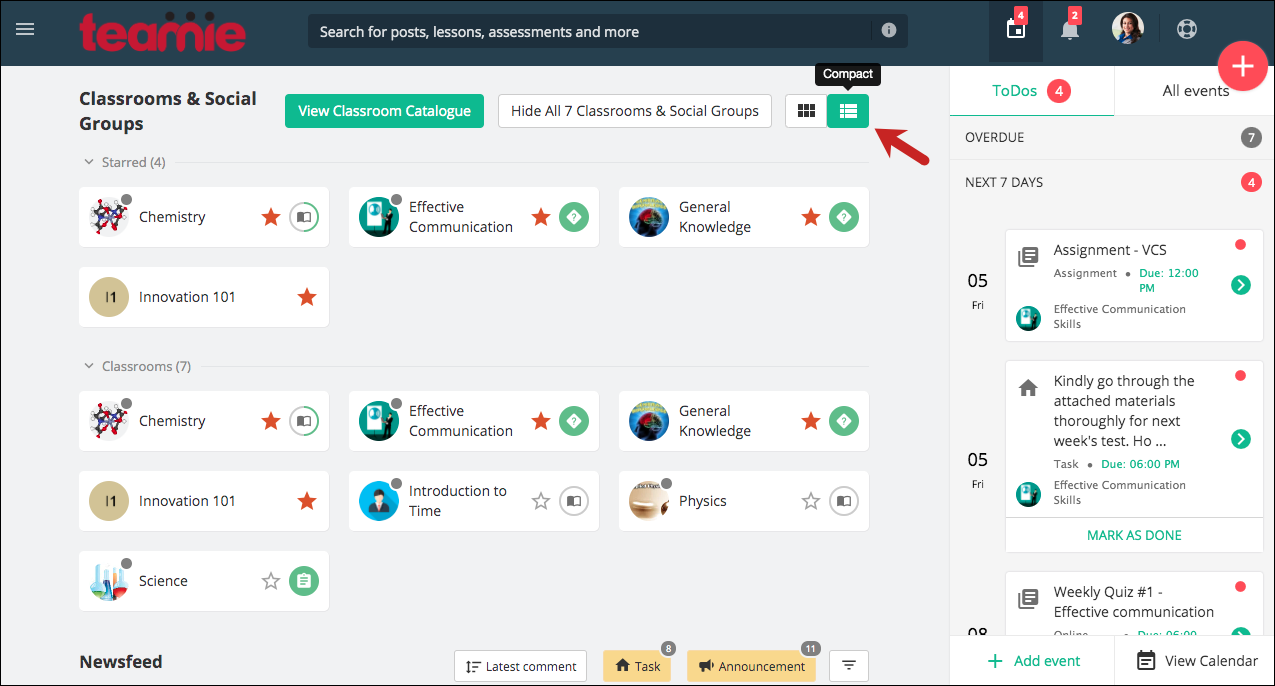
So, the standard landing page layout will now show four classroom cards in a row instead of three. Two classroom rows will be shown by default.
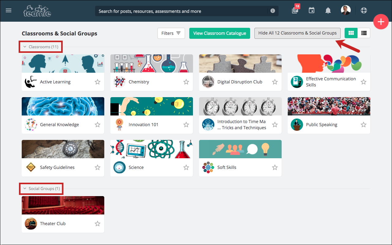
You can tap the View All n Classroom & Social Groups button to view all your classrooms and social groups (if any). Similarly, you can tap the Hide All n Classroom & Social Groups button to go back to the initial state. Here n is the total number of classrooms and social groups that you are a part of.
In case you have starred some classroom(s) and social group(s), then only those will be shown on the homepage for quick access.
Although, you can always view all your classrooms and social groups with one click.
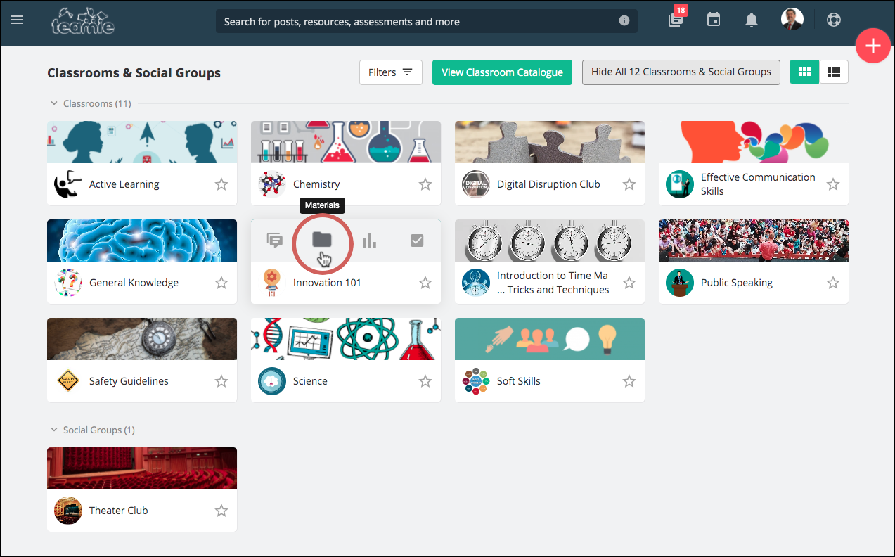
And as of before, you can still quickly access the Posts, Materials, Gradebook, and the Dashboard tab (instructors only) of a classroom by hovering over the classroom card.
Similarly, like before, learners would be able to quickly access their next materials / current material from the classroom cards.
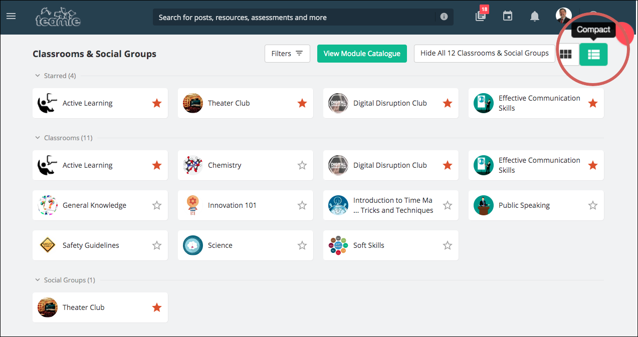
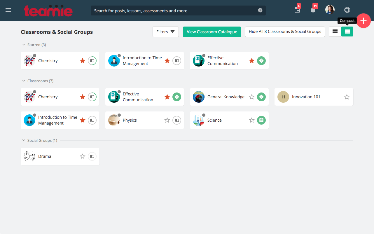
In case you have a large number of classrooms, you can easily fit them on your screen by using the all new Compact view.
Compact View
The compact view provides a closely packed look to accommodate more classrooms and social groups in the same space. This can be especially useful for users with a large number of classrooms. Despite being compact, it conveys a bunch of information, such as the number of new posts in the classroom and the next to read / current material along with the ability to star the classroom.
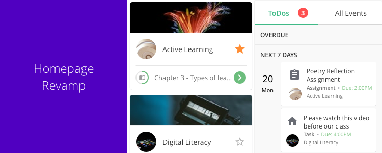
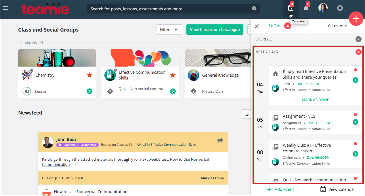
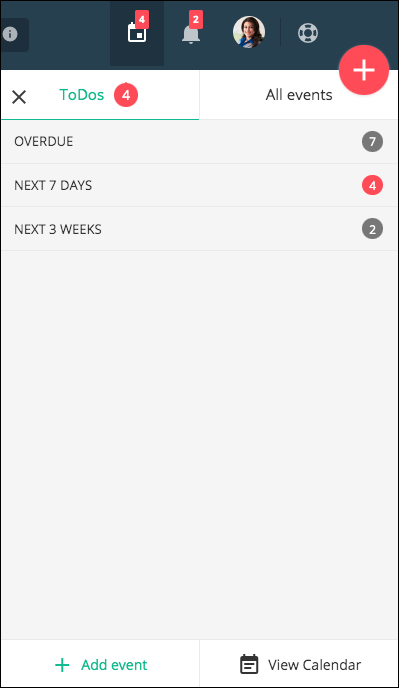
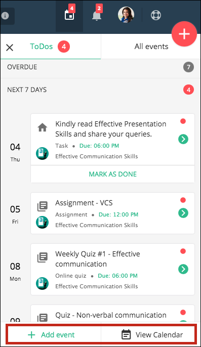
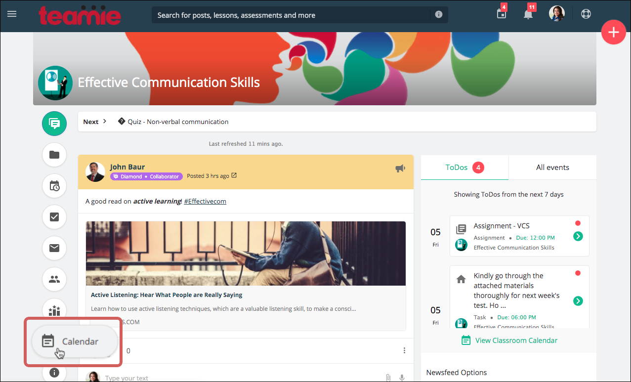
In addition to this, we have revamped the ToDos and All Events section for the learners. By default, they will see the ToDos / all events for the next seven days in the Calendar sidebar. A count for the number of ToDos will be shown as a badge on the right-hand side.
Two more sections are present in the calendar to view – OVERDUE and NEXT 3 WEEKS, which show the overdue ToDos / all events for the past one month and upcoming ToDos / all events for next 3 weeks, respectively.
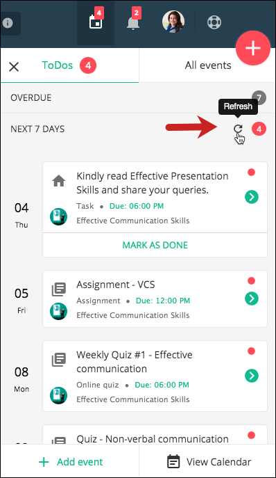
Each section has its own refresh button to refresh its events.
Users can also add events or navigate to the full calendar from here.
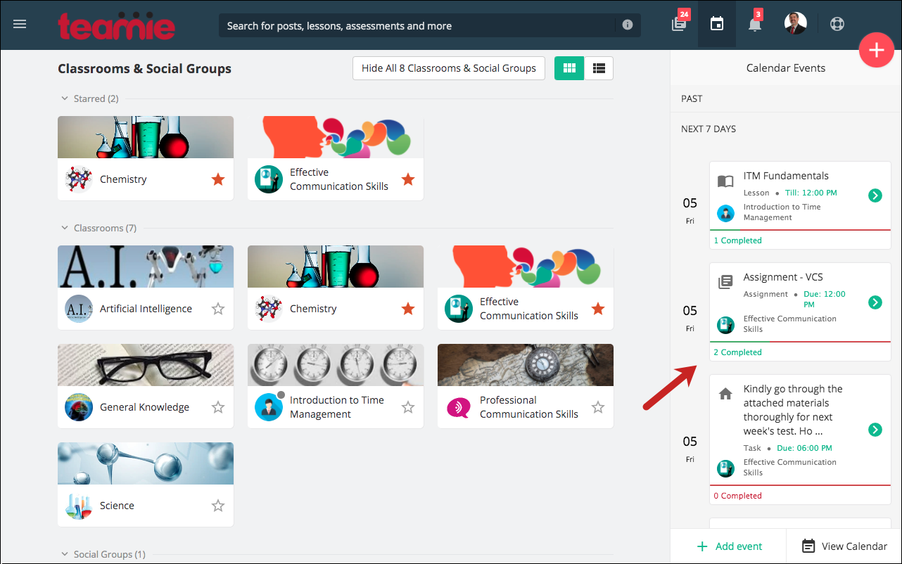
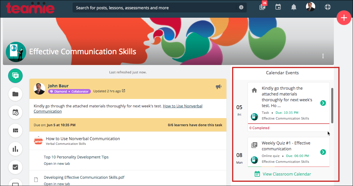
Similarly, instructors will be able to view the past one month, next 7 days, and next 3 weeks calendar events, including the submission status of the assessments. This means that, for assignments and online quizzes, instructors will see a progress bar indicating the submission progress of the learners. This will help them view learners’ progress at a glance 🙂
| ?We have also designed the Calendar sidebar such that the landing tab of the sidebar can be configured too. This means that we can configure the default tab for the Calendar sidebar from the ToDos and All Events section for learners to land on. |
Landing page with fixed calendar sidebar
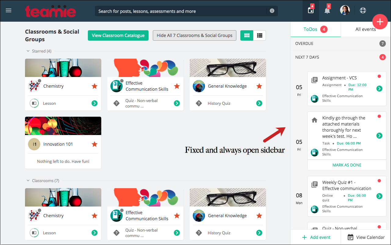
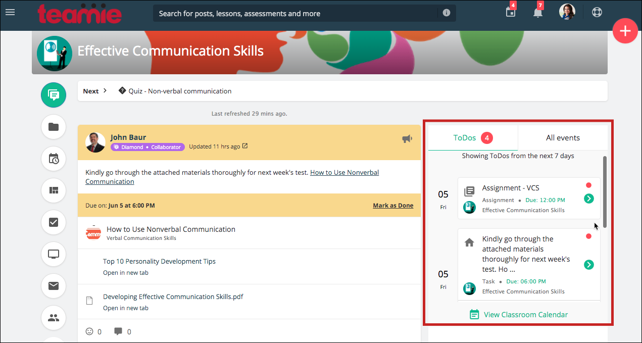
This configuration, if enabled on your Teamie site, will always display the Calendar sidebar as open and fixed on the right of the landing page.
Learner View
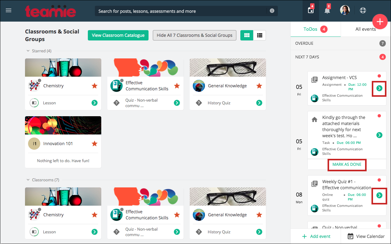
This view is helpful for institutes and enterprises who wish to keep learners informed of the deadlines and engaged at all times with the task in hand. Furthermore, the always open sidebar helps learners to quickly navigate to the materials’ submissions and mark their tasks as done.
Similarly, instructors can see the submissions and completion status of materials and tasks for the upcoming events at all time and navigate to them quickly using the Calendar sidebar.
Instructor View
Similar to the standard landing page configuration, this configuration also has a compact view to show a large number of classrooms at a glance.
Note: As you can see from the above screenshots, four classrooms are shown as opposed to the three classrooms of the standard landing page view. This is done to accommodate the fixed Calendar sidebar.
Classroom Events Widget
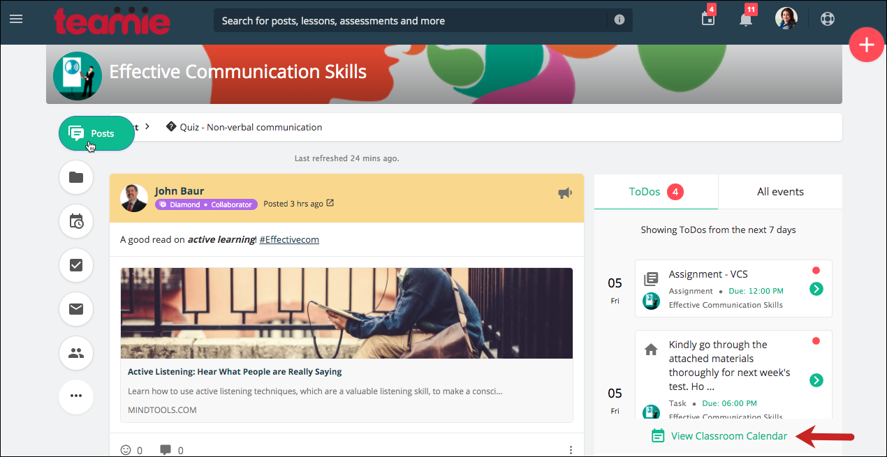
If the aforementioned fixed ToDos configuration is enabled on your site, then a calendar widget will also be shown on the Posts tab of all classrooms.
The widget will show you the ToDos / All events for the classroom for the next 7 days, in the respective sections. Unlike the homepage calendar, this widget will not show the overdue/past or next 3 weeks’ events. The idea being that users would be able to view the near future events quickly for a classroom.
Learner View
Instructor View
There will be a View Classroom Calendar link in the widget, tapping on which will take the user to the Calendar tab of the classroom. For instructors, we had introduced the classroom calendar view in our last update, which will be shown when an instructor clicks the View Classroom Calendar link on the widget.
Classroom Calendar – Instructor
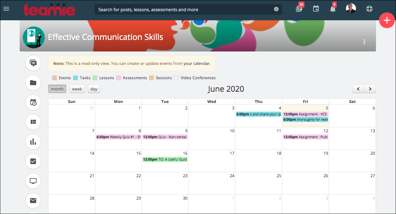
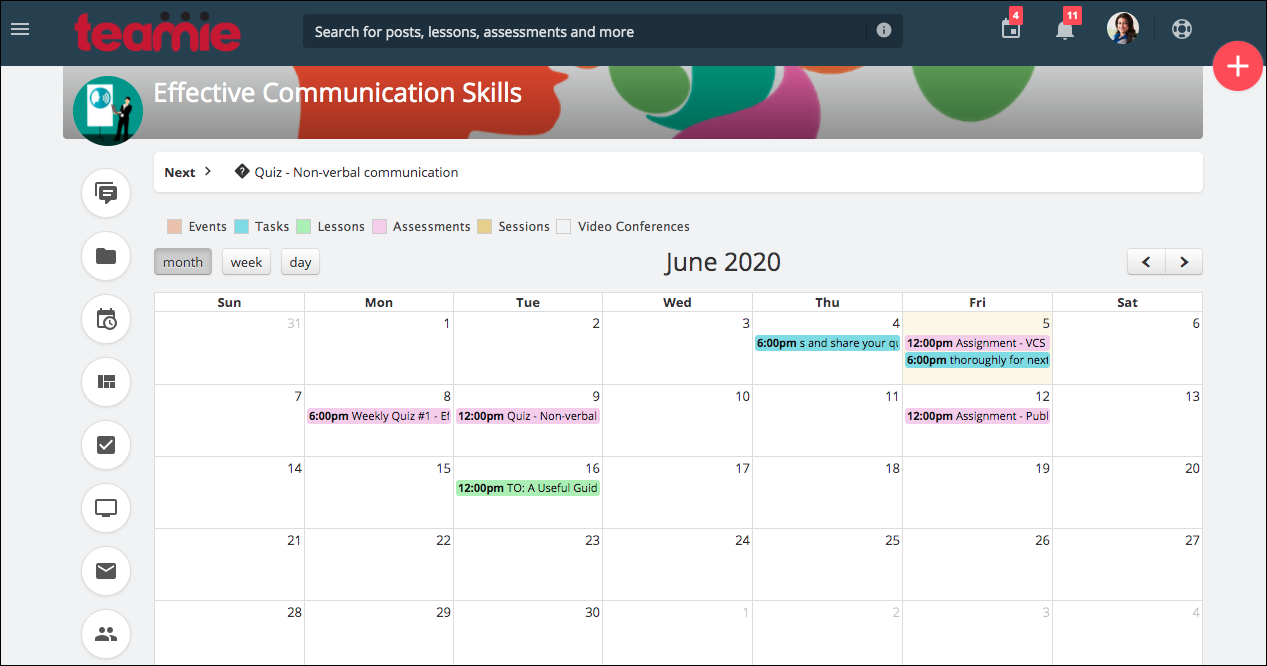
We have extended the classroom calendar to learners as well with this update. You can read more about that in the next section. So, when learners click on the View Classroom Calendar link from the widget, they will be directed to the newly introduced classroom calendar.
Classroom Calendar – Learner
Newsfeed Configuration
We have introduced a single-column newsfeed instead of the previously present two-column newsfeed. The single-column layout makes it easier for learners to view the latest posts in a reverse chronological order. Also, the increased size of the posts make it visually appealing and adds to a better user experience. Let’s see how the new newsfeed works with the aforementioned two landing page configurations.
Newsfeed with standard landing page
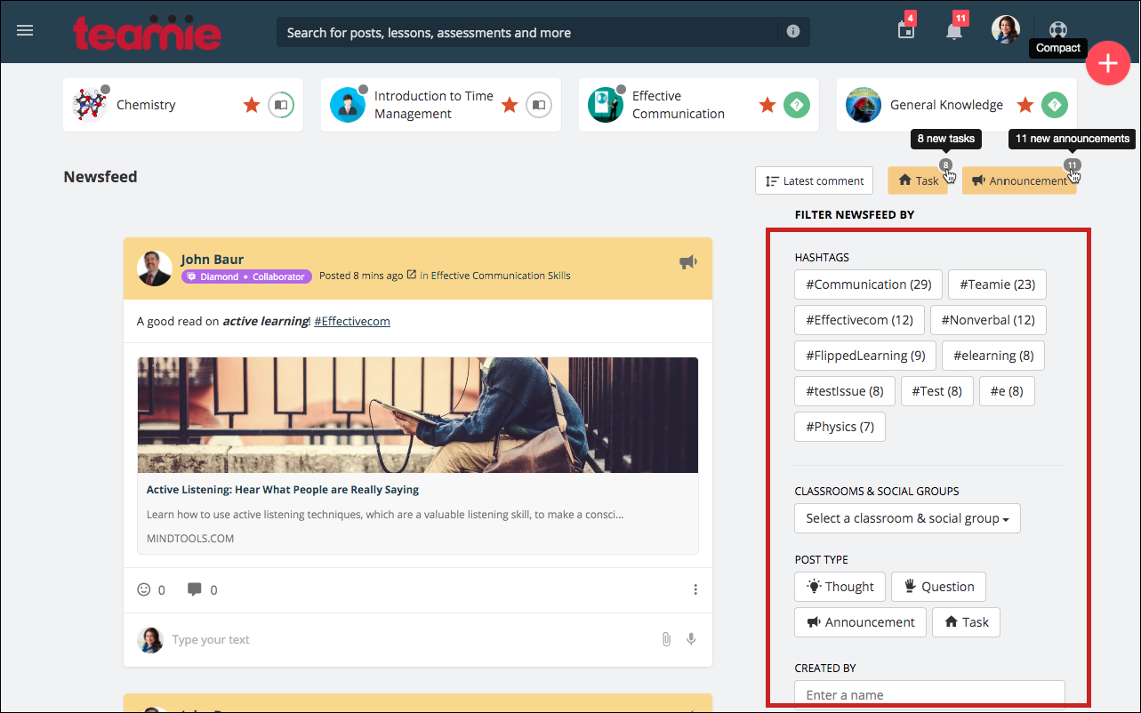
This combination of standard landing page with single-column newsfeed layout incorporates four classroom cards in a row followed by the newsfeed.
Single-column Newsfeed
The newsfeed filters are housed on the right side of the newsfeed with improved functionality, such as badge count for new tasks and announcements, and a revamped latest comment / post toggle.
Newsfeed with fixed calendar sidebar
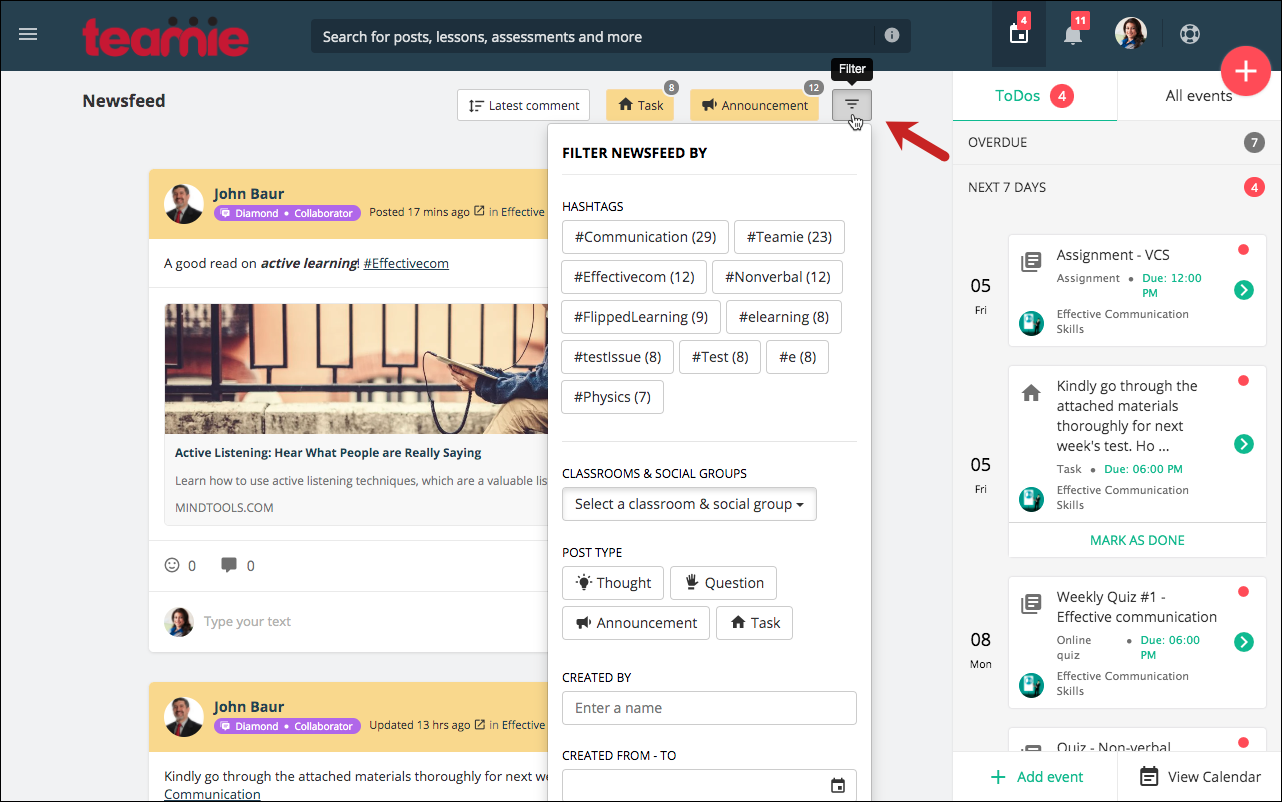
For this landing page configuration, three classroom cards are shown with the fixed and open calendar sidebar on the right.
Single-column Newsfeed with fixed Calendar Sidebar
The newsfeed filters are intuitively positioned in the form of a collapsed icon to accommodate the landing page configuration. Clicking the Filter button expands a filter in a pop up for you to filter the aggregated homepage newsfeed.
We have also added a configuration to not show any collated newsfeed on the landing page. Although, it is highly recommended to have a collated newsfeed as it shows all the posts aggregated from all the classrooms / social groups that you are a part of, but, in case you wish to have only the classrooms and social groups listed on your landing page, then we still got you covered.
Standard landing page without collated newsfeed configuration
Landing page with fixed Calendar sidebar and without collated newsfeed configuration
We hope that this homepage revamps will help you deliver and consume learning in an even more efficient manner. Give us a shoutout or write to us about what you think of this revamp!
Classroom Calendar for Learners
In our last update, we introduced a new tab, Calendar, in classrooms. This tab shows all the calendar events that are created for that classroom. But, this view was limited to users with instructor roles in that classroom. Now, we have extended this view to learners as well.
Similar to how learners can view all the events by filtering for a classroom in their profile calendar, they can now view them just by accessing the Calendar tab for their classrooms.
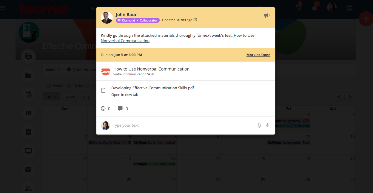
Furthermore, learners can click to view the task/event details in the calendar in the form of a modal.
Whereas, clicking on a material’s item will take the learner to that material’s full view.
As aforementioned, this view can also be accessed from the ToDos / All Events section on the Posts tab of a classroom.
Teamie – Azure AD B2C SSO Integration
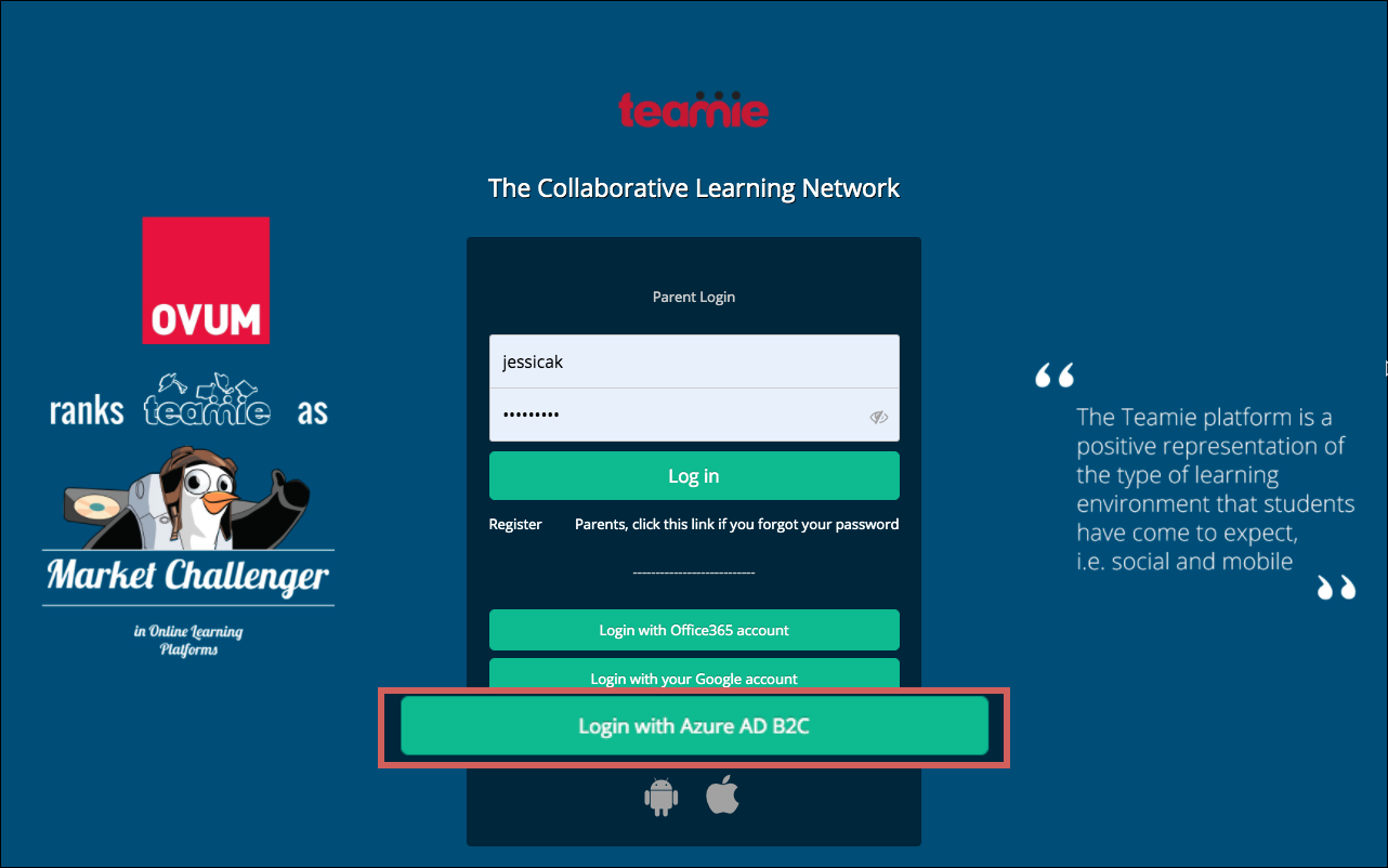
Single sign-on (SSO) session management in Azure Active Directory B2C (Azure AD B2C) enables an administrator to control interaction with a user after the user has already authenticated. For example, the administrator can control whether the selection of identity providers is displayed or whether account details need to be entered again.
You can now use Azure AD B2C to login to Teamie after this integration is configured on your Teamie site. Kindly contact your Teamie account administrator or write to us if wish to configure this integration on your Teamie site.
So, that’s it for this update. See you soon with a fresh new update. Till then, stay healthy and stay collaborative!
